Task 1
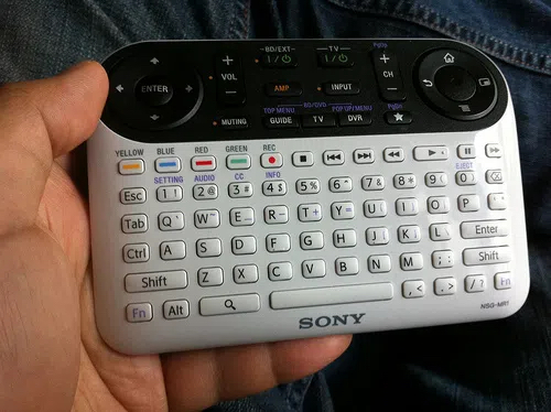
Describe in the following paragraphs the images of the 10 selected objects shown in the gallery:
- The affordance of the device – the relationship between the owner of the object and the capabilities of the subject determines the extent to which the thing is used.
The realization of the possibility of action.
- Device tags – providing users with messages about the use, structure, and operation of a particular device
- Mapping – synchronization between tags and activities
- Feedback – signal after action when using the device
- Rating: good design / medium design /bad design. Consider the ratings from points 1-4 as well as the appearance of the device and its functionality.
- Create a gallery of self-selected 5 devices from your environment on your website and describe them in this way.
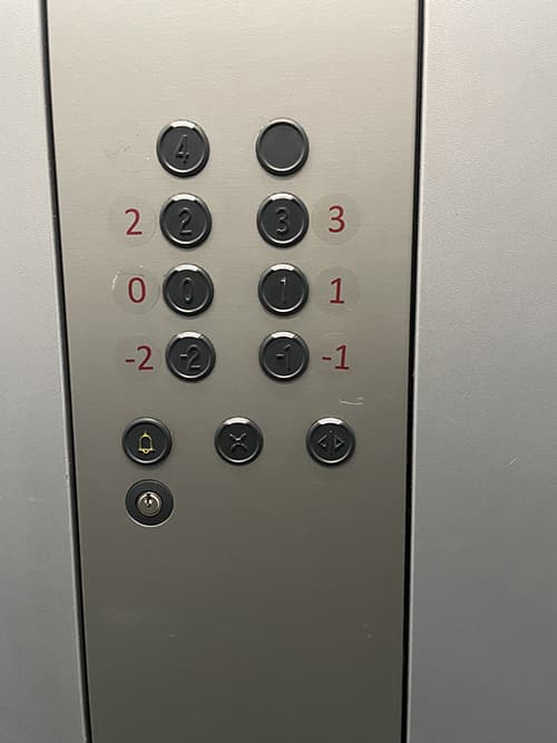
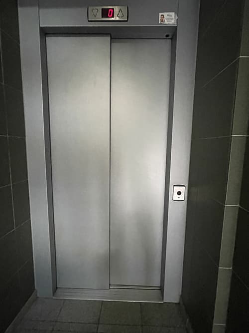
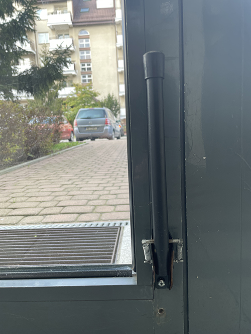
afordancja-3
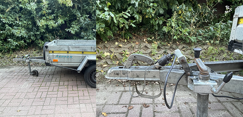
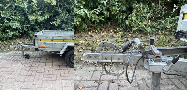
afordancja-4
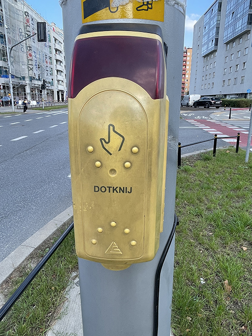
afordancja 5

afordancja-5-1
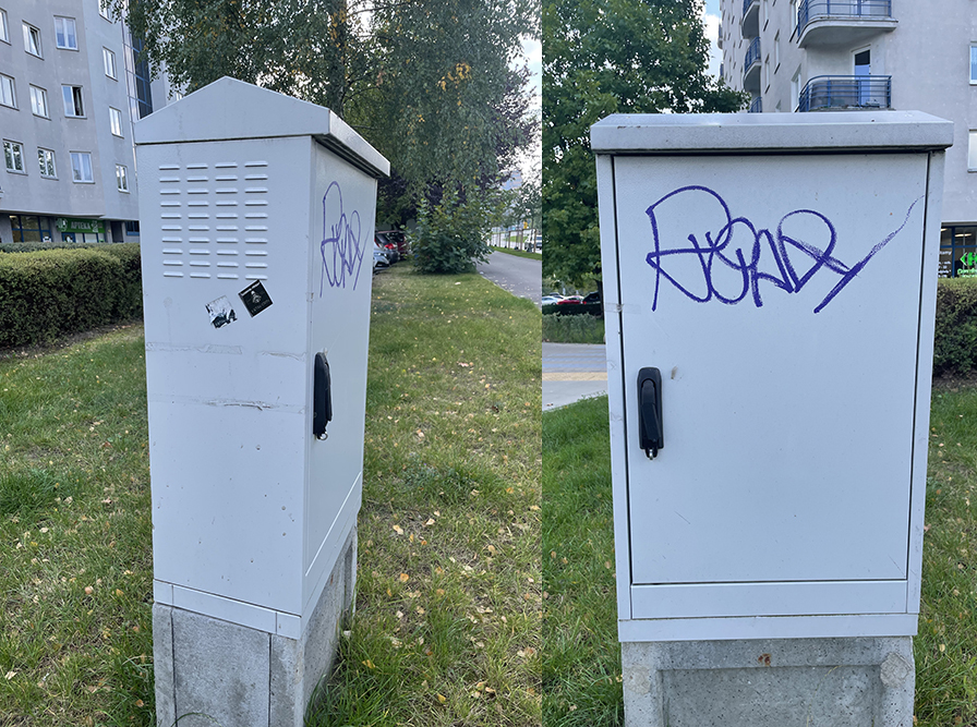
afordancja-6
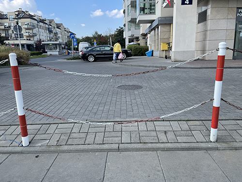
Affordance 7
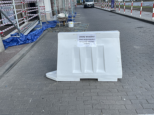
afordancja-8
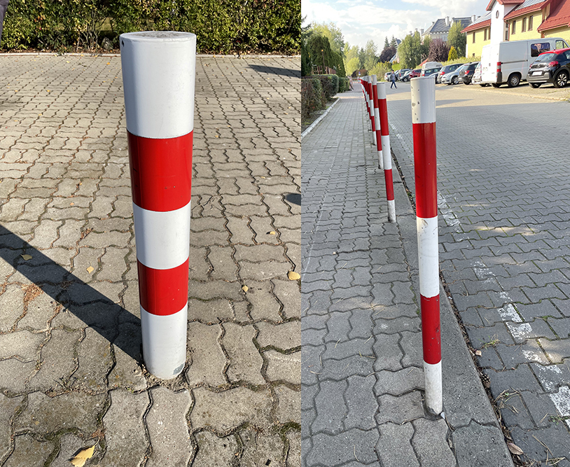
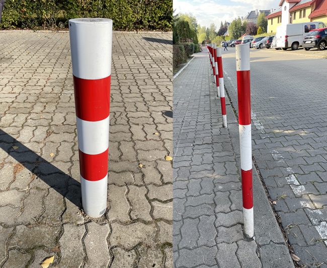

afordancja-10
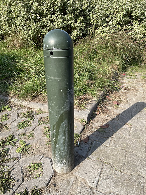
afordancja-11
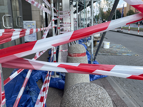
afordancja-12
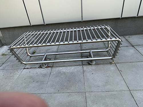
afordancja-13
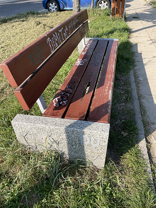
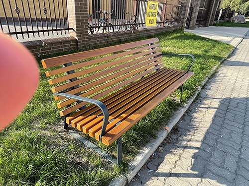
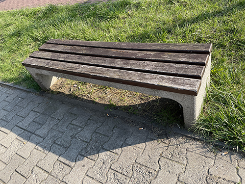
afordancja-16
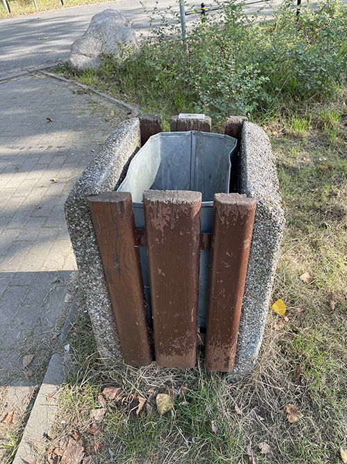
afordancja-17
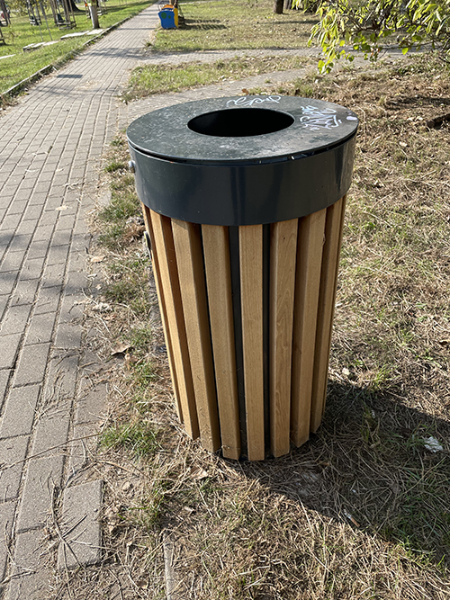
Afordance 20
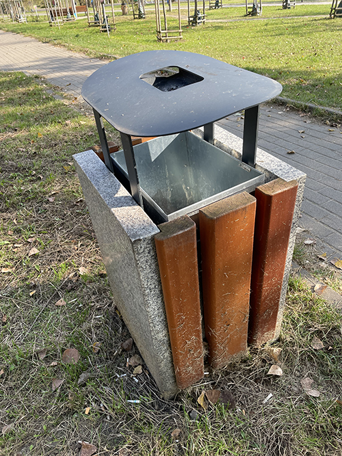
Afordance 19
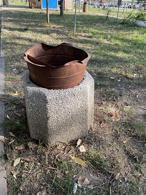
Trash bin
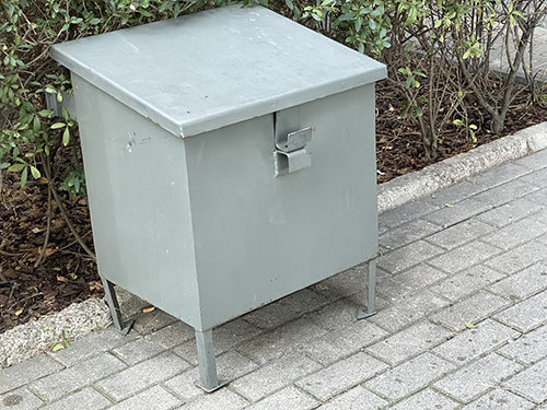
afordancja-21
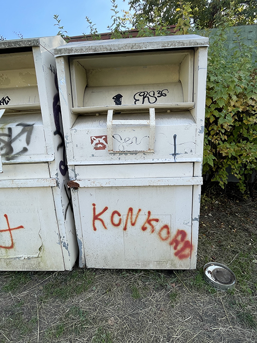
afordancja-23
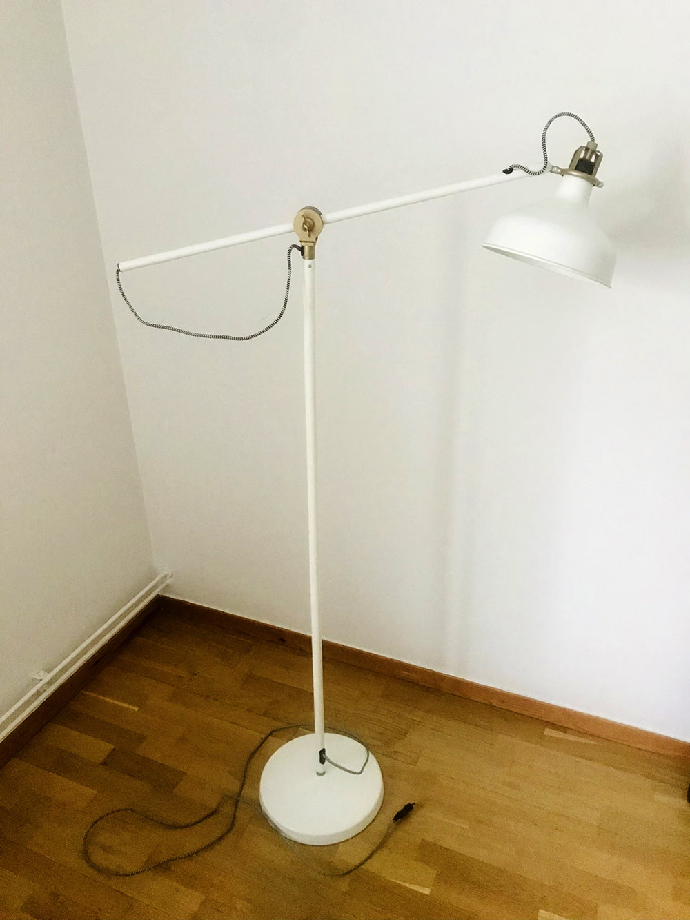
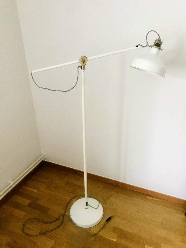
Description example
Affordance 17
Municipal trash garbage can
- Realizing the possibility of action – comes from acquired knowledge. The garbage can is a commonly present object in urban space
- Marker – the design of the garbage can – the deep container indicates the purpose of using the garbage can – throwing things in (waste)
- Mapping – none
- Feedback – none
- Basket built with solid durable materials which will ensure long-lasting use, medium design
Task 2
Present an artwork selected from your body of work as a project or part of a UX project. Describe the process of working on the project according to the presentation structure in the form of a case study.
Step 1: Take Inventory of All Your Projects
Ask yourself the following questions:
• What am I really good at?
• Which UX activities do I really like to do?
• What differentiates me from other designers?
Step 2: Choose 1 Project as Detailed Case Study
In addition to visuals, a case study includes the following information:
1. Your and your colleagues’ role in the project
2. Introduction — scenario/problem/goal
3. Who are the users
4. Design Process
5. What tools did you apply in this project?
6. Research
7. Sketches, wireframes, graphics, prototype
8. Results and takeaways from a Usability test/before and after applying UX Design to the
product
9. Your final design — style guide
10. Conclusion / The impact
11. What did you learn from the project
12. What would be the next steps
Include relevant photos and screenshots that tell the story, including early sketches, whiteboards,
research documentation, or final images.
Answer the question: What are the top three things about you and your work that a reader of your portfolio
should take away?
What Hiring Managers Are Looking For
• Show me how you started with an opportunity and produced real value for a user and
the organization.
• I’m curious to know what isn’t in the design and why just as much as I’d like to know why
elements made it.
• Don’t just show me the finished product. I want to see the messy process and all the
work and research that was put into land on that shiny polished design. Tell me the
problem you were trying to solve, your role, constraints, project timeline, changes
from iteration to iteration, and how the research informed the design.”
- What am I really good at?
I study graphic design. Most of the subjects are related to digital graphics. They are important to me because of the professional graphic design work I will do in the future. One of the subjects is painting and drawing. I like this subject. The manual work gives me pleasure and satisfaction. I think that I am really good ar painting and drawing. - Which UX-related activities do I really enjoy doing?
I like to do research before doing a project. The results of the research give me an insight into the potential audience of my project - What sets me apart from other designers?
What sets me apart from other designers is my unique artistic personality.
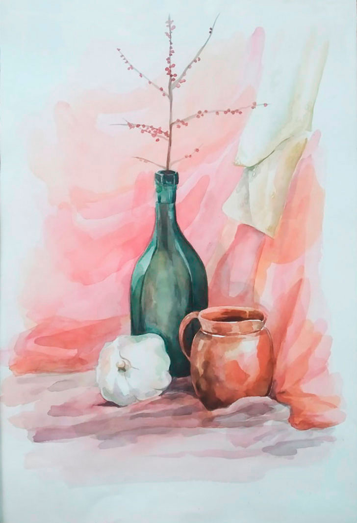
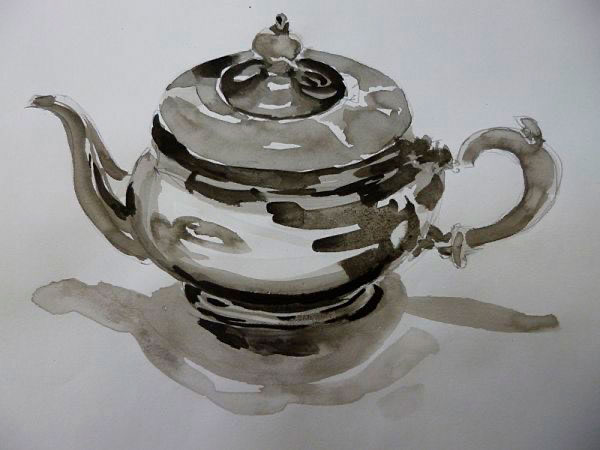
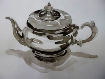
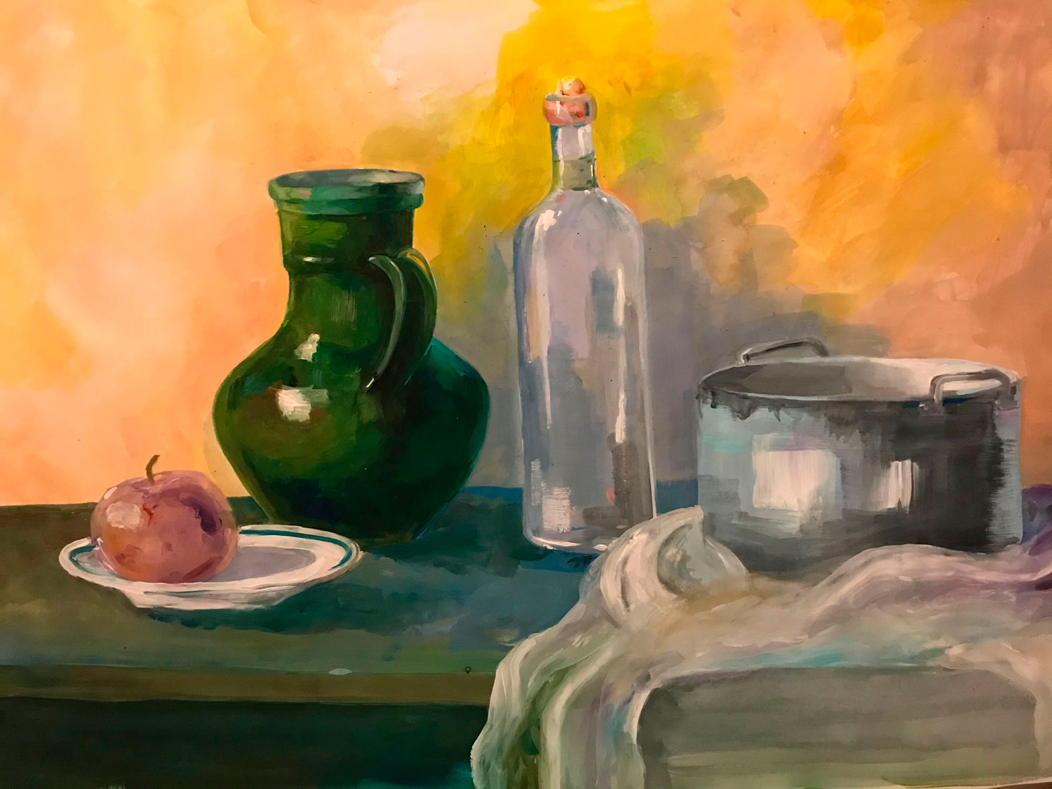
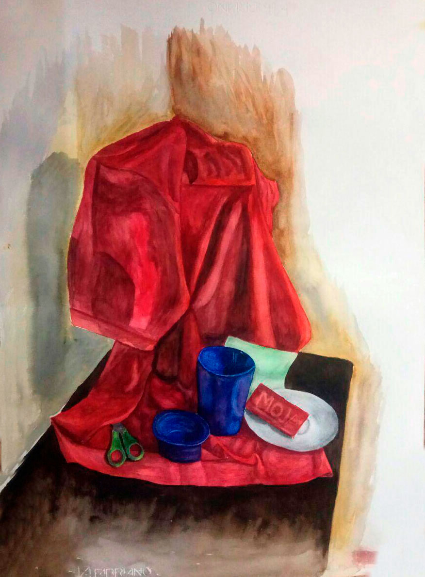
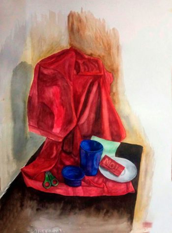
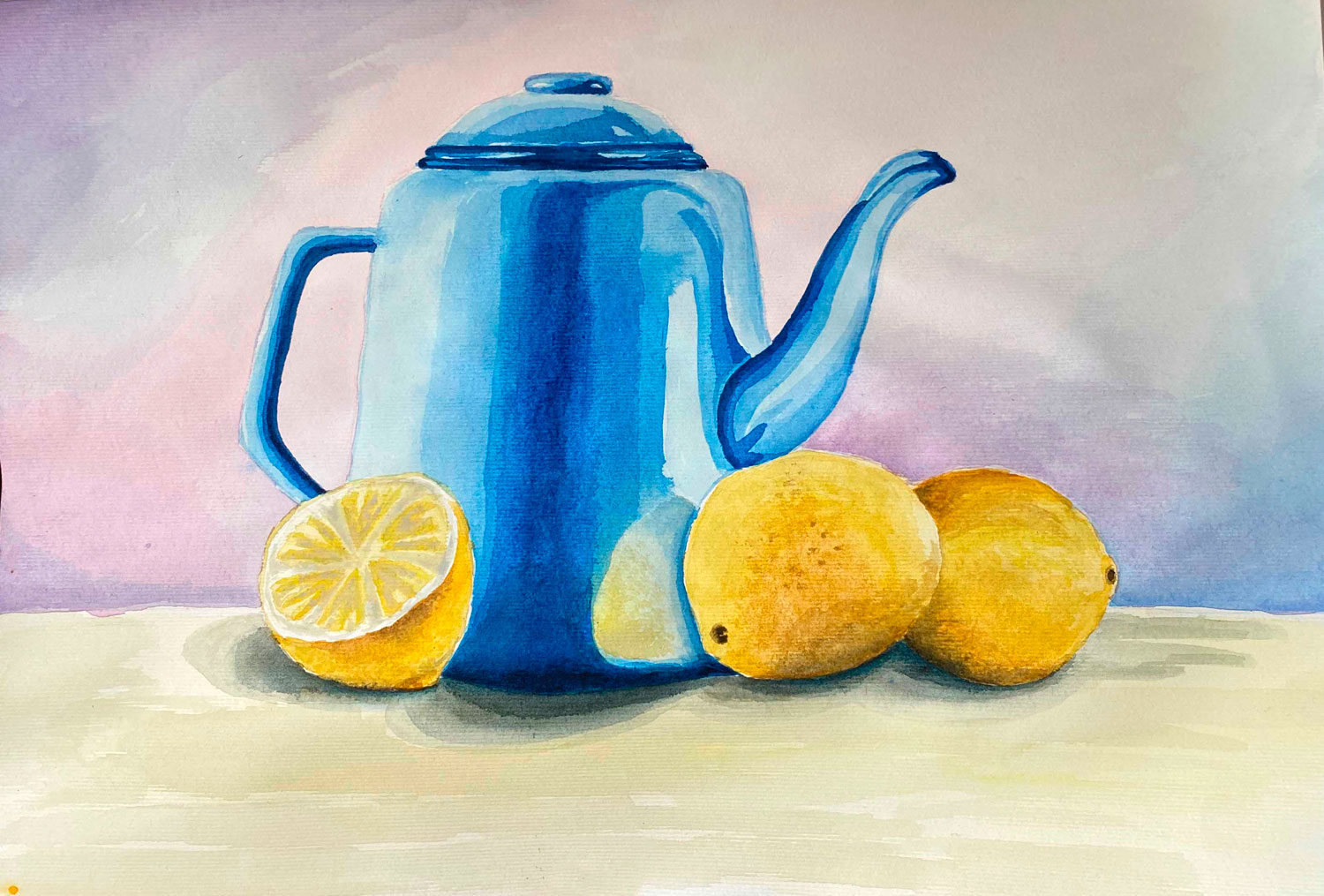
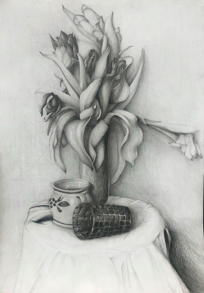
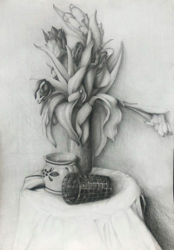
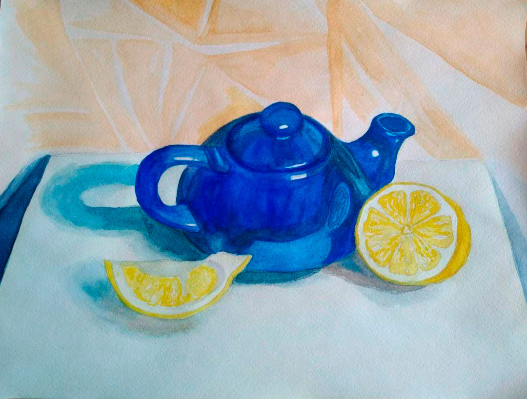
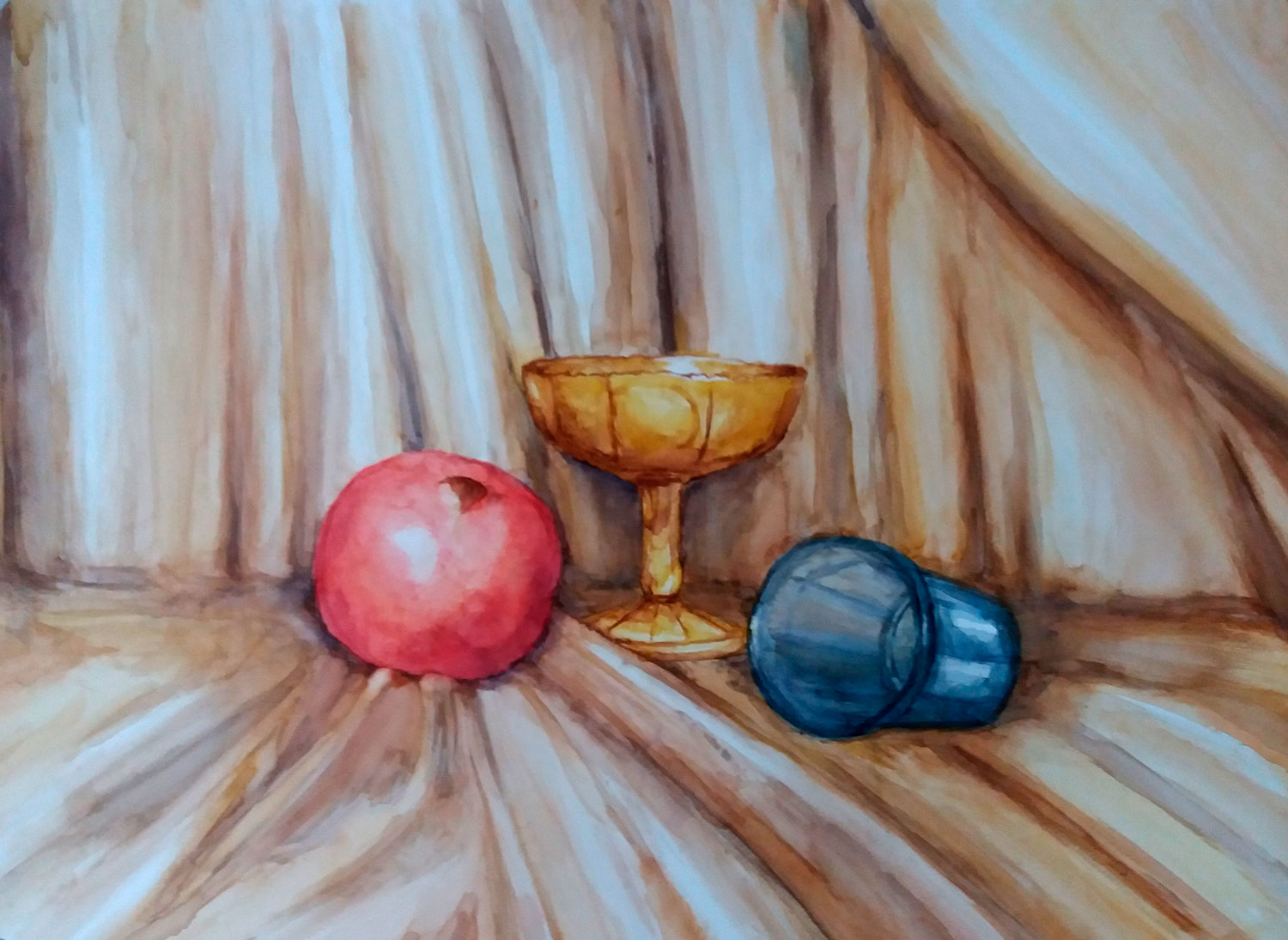
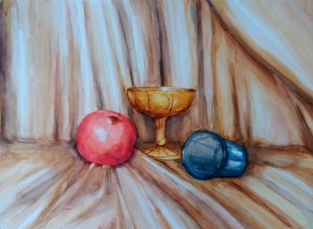
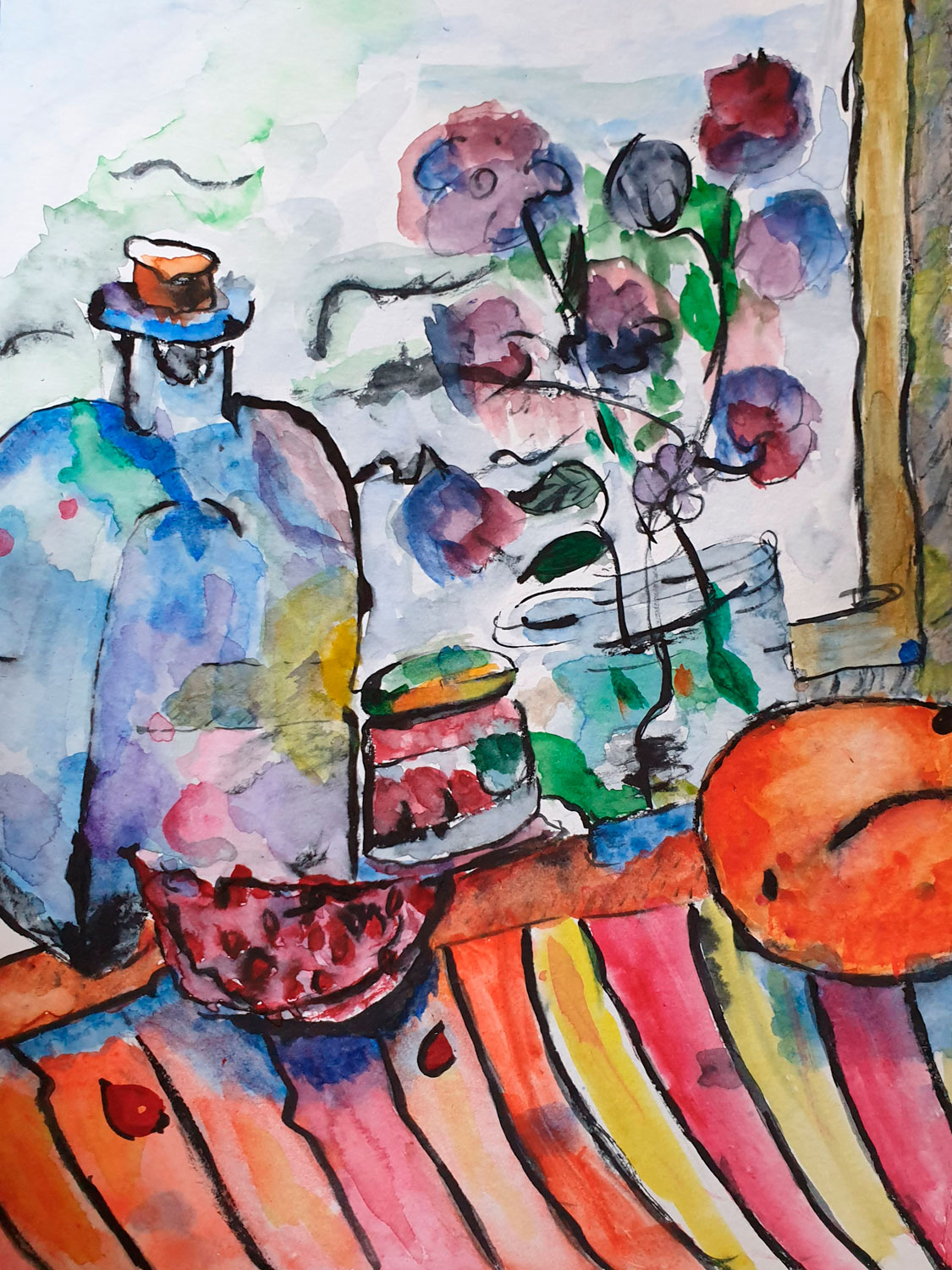
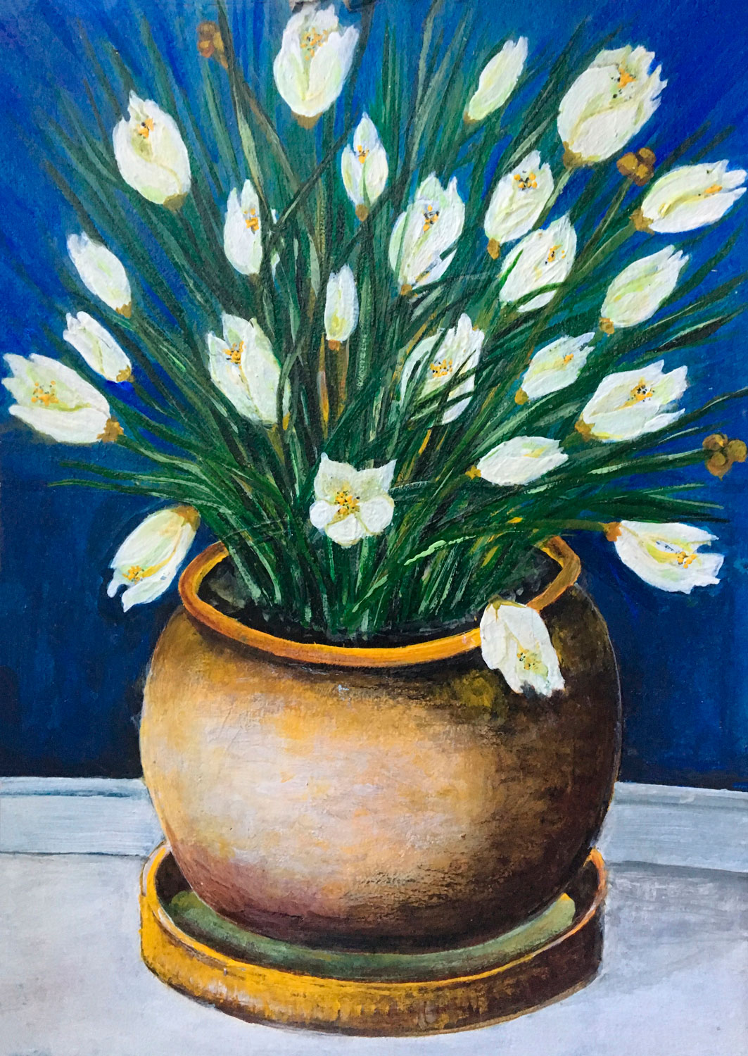
Still life – is it really still?
exhibition at Stokłosy Community Centre, Ursynów, Warsaw
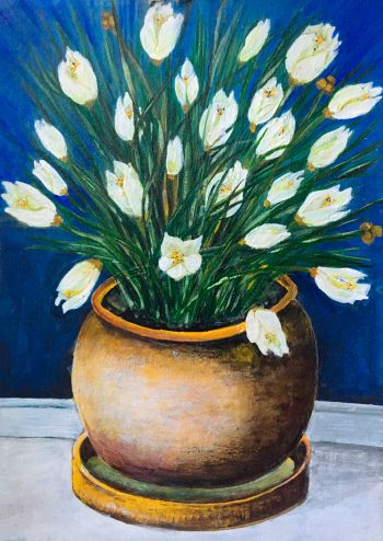
My role in the project
- Making the paintings for the exhibition
- Framing of paintings including hanging system. Oil paintings framed in simple wooden frames works on paper in standard metal frames
- Delivery to the community center
- Assistance with mounting the exhibition
- Provision of information necessary to produce publicity materials: artist biography, photographs of works, exhibition credo.
Role of other team members
- Installation of the exhibition
- Production and dissemination of publicity materials
- Advertising on the web
Introduction
Scenario: the exhibition is a display of 30 works by me. The works are presented in two rooms in the Stokłosy Community Centre. Both rooms are adapted for this purpose. They have the right lighting and good exhibition conditions.
Problem: people do not visit exhibitions, they are not oriented to art.
Goal: paintings depicting so-called ‘still life’ is associated with something old, no longer current, and museum-quality. The aim of my exhibition is to show that a contemporary artist can be interested in depicting compositions of inanimate objects. Paintings can arouse interest in everyday objects. The viewer, in addition to the aesthetic experience provided by the paintings, can be inspired to observe the objects he or she uses every day. He or she has the chance to perceive their qualities, not only functional but also aesthetic.
Project users
Residents of Stokłosy housing estate, random visitors, and invited guests.
Design of the project – an exhibition entitled: Still life – is it really still?
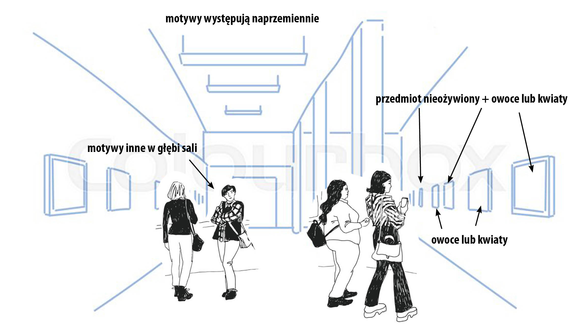
- Categorizing paintings according to the painting technique
- Categorizing paintings according to the type of objects in the painting
a) inanimate object + fruit or flowers (plant products)
b) fruit and flowers
c) other
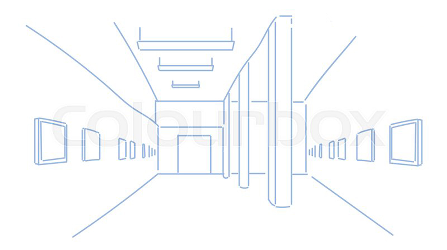
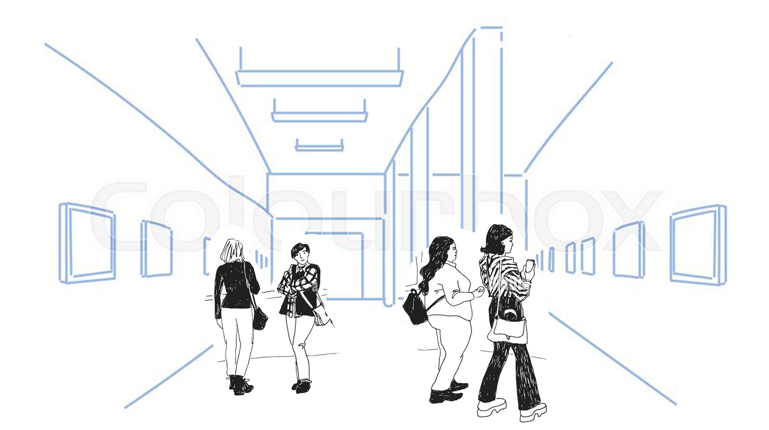
Arrangement plan of the paintings in the two halls, taking care to ensure the diversity of the exhibition and an even mix of the categories of paintings.
Tools used in the project
In the implementation of the project, the work proceeded in two stages:
- Exhibition planning – placement of images. Tools: computer, tablet, excel document
- Hanging the exhibition – hooks, hangers, wire, hammer
Research
- The survey among residents – people met at the housing estate – 100 people – women/men of different ages, youth
- The survey among employees of the culture department of Warsaw Ursynów District Office – all employees of the department – 5 people
The survey among residents
- Are you interested in art?
- Do you go to exhibitions? How often?
- Would you visit an art exhibition at Stokłosy Culture House?
- What do you associate with “still life”?
- Do you pay attention to the appearance of everyday objects?
The survey among the employees of the culture department of Warsaw Ursynów District Office
- Do you think that painting exhibitions are needed at the community center?
- Do you think art exhibitions are held too rarely/too often?
Research results
XXXXXXXXXXXXXXXXXXX
Sketches, mock-ups, prototype
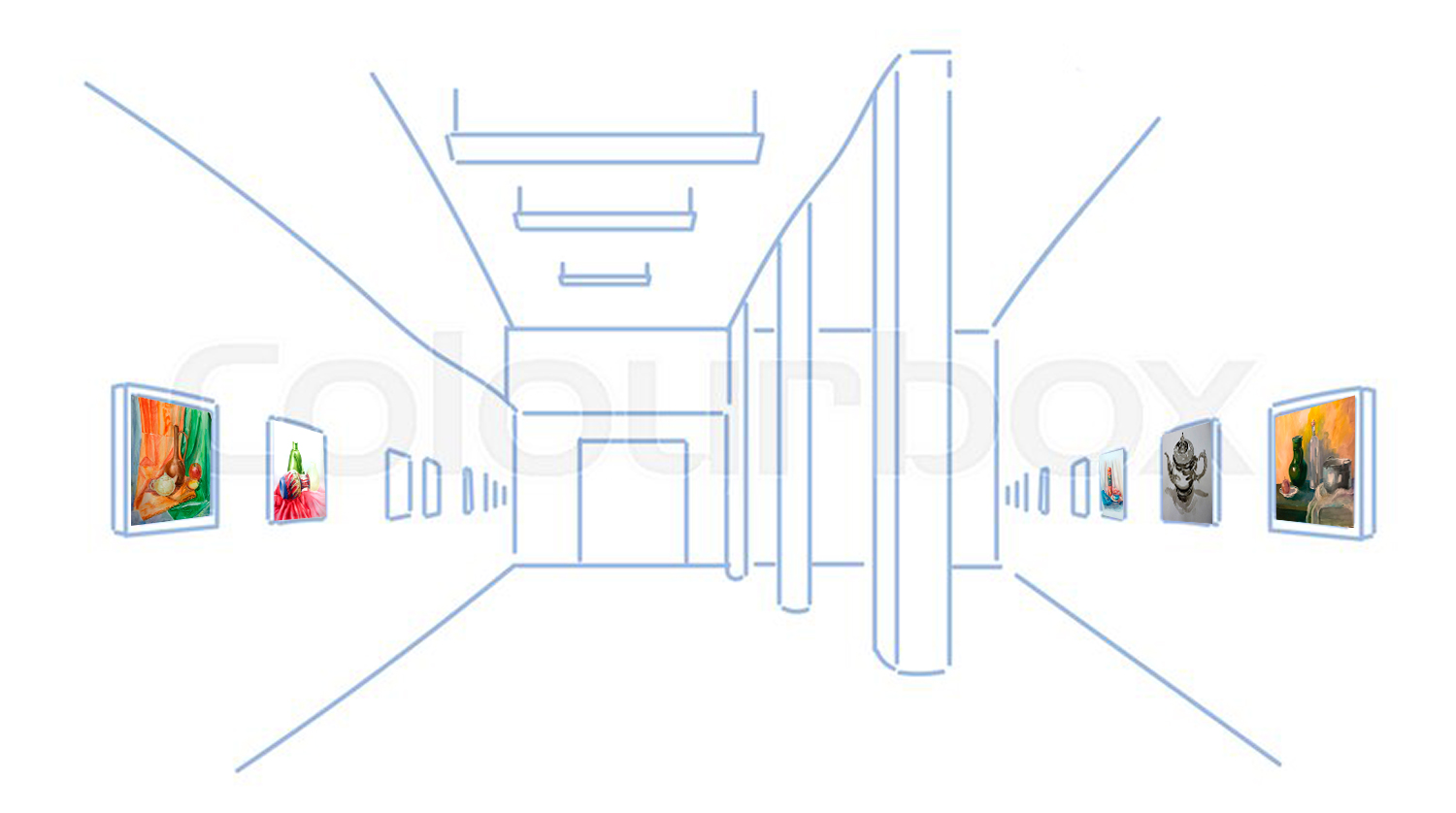
Results and conclusions of usability tests/before and after applying UX Design to the product
- Usability test of a cultural event such as an art exhibition at the Ursynów Cultural Centre before applying UX tools
The themes and dates of the exhibitions are random. They are not preceded by research among potential audiences. The reach of the exhibitions does not exceed the boundaries of the housing estate - Usability test of a cultural event such as an art exhibition at the Ursynów Cultural Centre after applying UX tools
The exhibition, preceded by research, is geared towards the defined needs of the audience, to arise new, positive, aesthetic impressions.
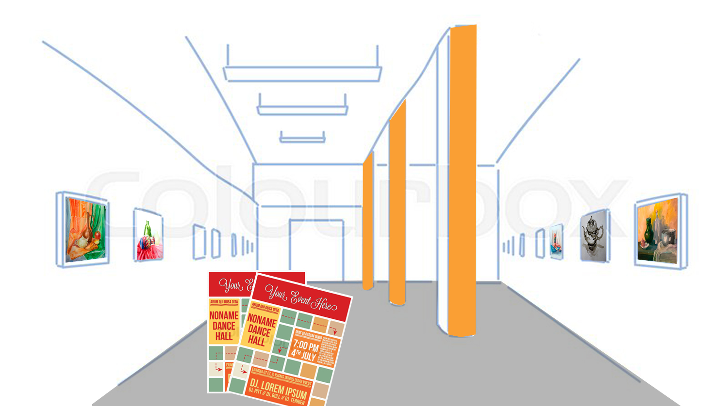
The results of the research provided the basis for the content of the exhibition message and advertising material.
My project – a style guide
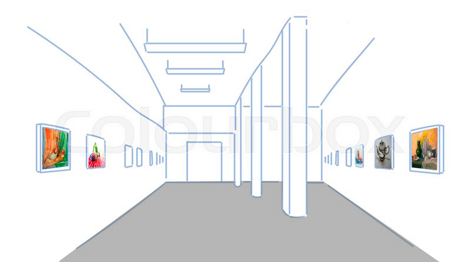
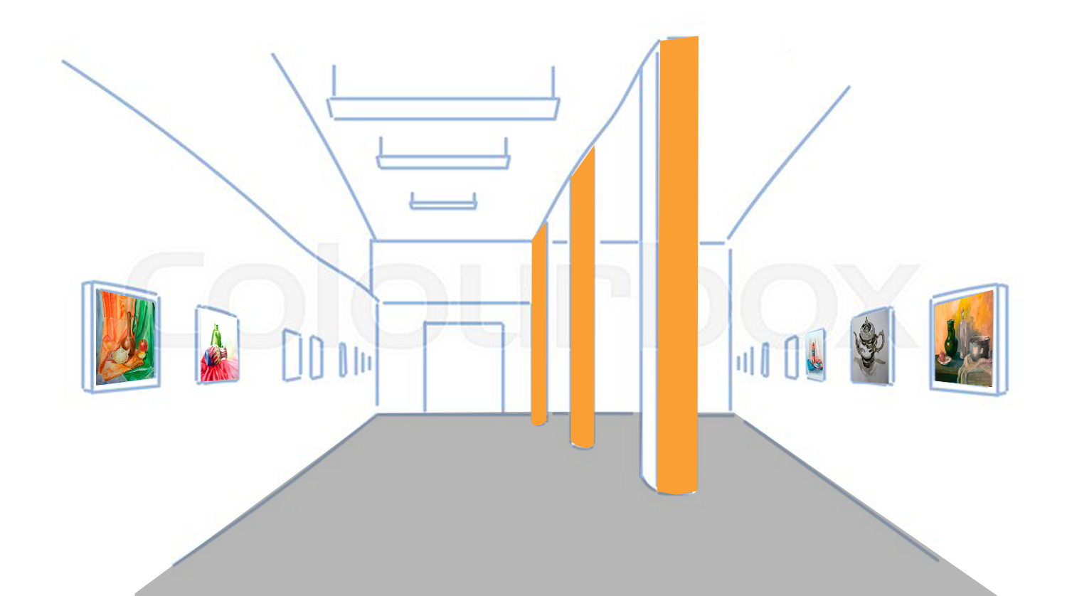
Styl wystawy jest zależny od warunków w sali wystawowej. Dominuje ciemny szary kolor podłogi. W celu przełamania tej szarości pokryłem słupy w sali ciepłym
The style of the exhibition depends on the conditions in the exhibition hall. The predominant color of the floor is dark grey. To break up this grey, I covered the pillars in the hall with a warm orange color. This set of colors has been repeated in the publicity materials.
In the exhibition, paintings from the two categories are placed alternatively.
Conclusions / Impact of the exhibition
The exhibition was very successful. The title of the exhibition – in the form of a question – aroused curiosity. People who visited the exhibition said that one of the reasons for coming to the exhibition was that they wanted to answer the title question: Still life, is it really still? They also hoped that the artist would help them if they did not know how to answer it. It turned out that the question itself and the answer to it is not the most important thing for the viewer. The audience liked the paintings: their intense colors, compositions, and subject matter. Many people expressed positive surprise that an attractive, modern image could be created by depicting ordinary objects. Still life turned out not to be still and dead, on the contrary, it turned out to be alive. The title of the project, as a marketing ploy, proved successful. The objective was achieved – a large turnout at the art exhibition in the local community center.
It is worth showing commonplace things through painting creation, through one’s own unique artistic personality.