Haivak Anna
- What am I really good at?
I am productive, efficiently deal with deadlines, and am adaptable. - What differentiates me from other designers?
I am unique in my thinking and brainstorming. - Which UX activities do I really like to do?
I like to create simple designs, understandable for everybody. - On which projects did I bring the most value?
The projects included concept art and character design. - From which projects did I learn the most?
I learned the most from the projects which required working with PC programs. - What exciting stories can I tell about the work that I did?
The most interesting stories I can tell are about concept art and design due to their sources.
Case study project ‘Tinta’ Art Journal
1. Your and your colleagues’ role in the project?
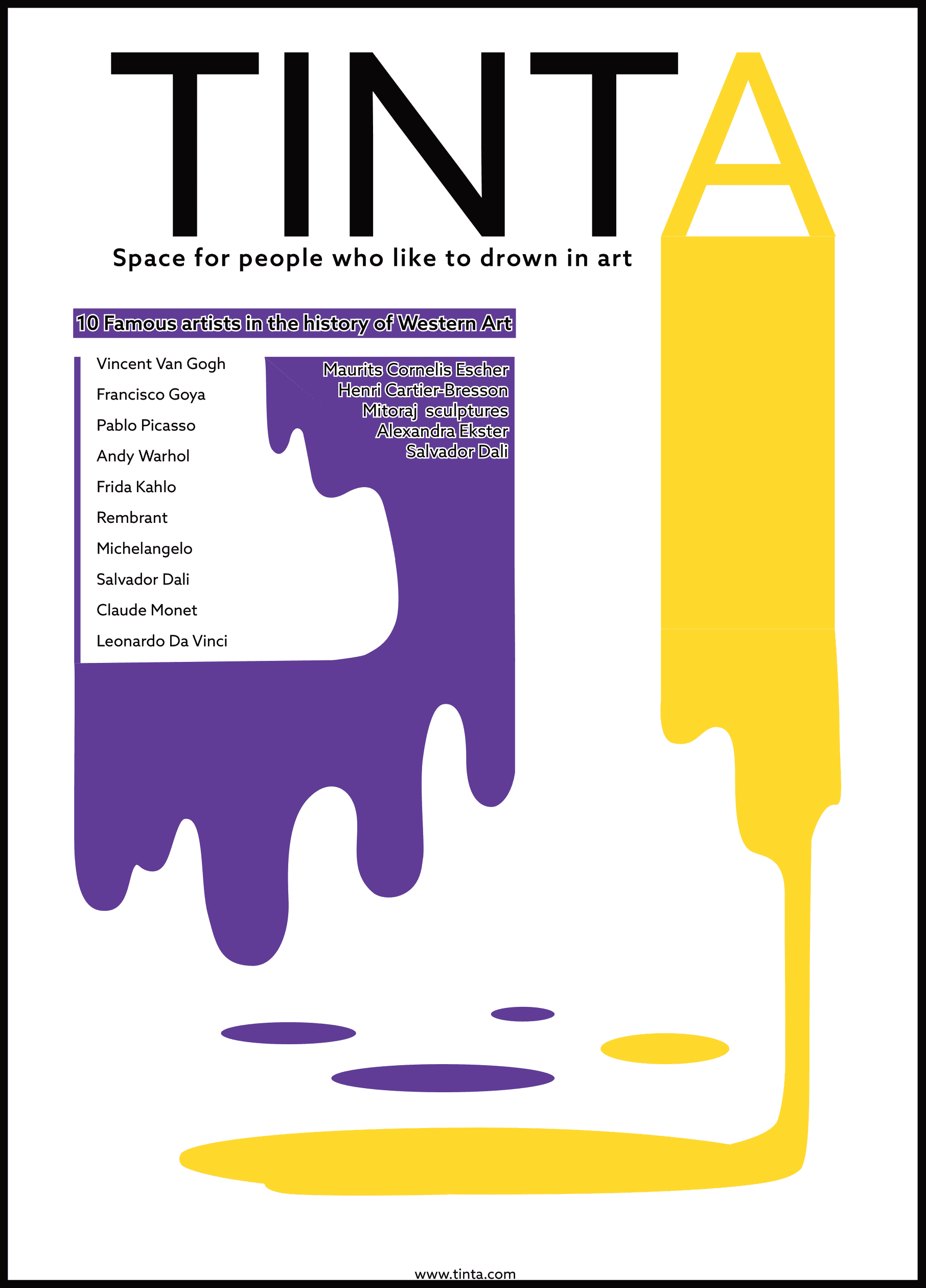
- Scenario – to create the name for the journal. As the main theme of the journal is art, I concentrated my attention on artistic names connected to things and terms connected to them, I used the English language and deformed the words to add them special style. The variations were: “The Blobby” (from blob), “Tinta” (from tint), and “BeDye” (combined be and dye).
- Problem – The problem was to properly present artworks and keep the readers interested.
- Goal – The goal here is to educate people about which artists are most famous worldwide for their contribution to art and its evolution, with the most known style and works for modern people, and present their works as examples and proof.
2. Introduction — scenario/problem/goal?
The base scenario was to create the name for the journal, a suitable design with a palette, and style the pages in a similar way. The problem was to properly present artworks and keep the readers interested. The goal here is to educate people about which artists are most famous worldwide and present their works as examples and proof.
3. Who are the users?
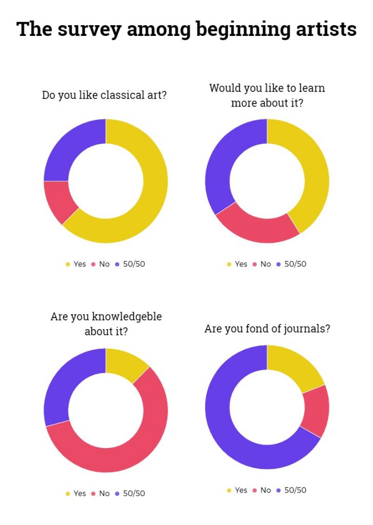
The users are people interested in reading short articles with pictures over books, and those interested in art and its history. Although the main target group is beginning artists who are willing to learn about classical artists, and people who had recently started studying art as the journal consists of brisk information and description which is usually known by people more advanced who are more advanced in art.
4. Design Process (methodology; roadmaps; metrics; research…)
- Create a name for the journal suitable for the art theme.
- Make a palette, style, and typography that would be used for all journal layouts.
- Design front and back pages including all the essential information by the publisher.
- Design inside pages of contents and the data themselves including all the descriptions with pictures.
- Consult with the publisher, polish the design, remove mistakes and finish the working process.
5. What tools did you apply in this project?
The main tools applied to this project are digital resources like pictures and the Adobe program InDesign, and research results in the form of typography with font and palette.
6. Research
7. Sketches, wireframes, graphics, prototype

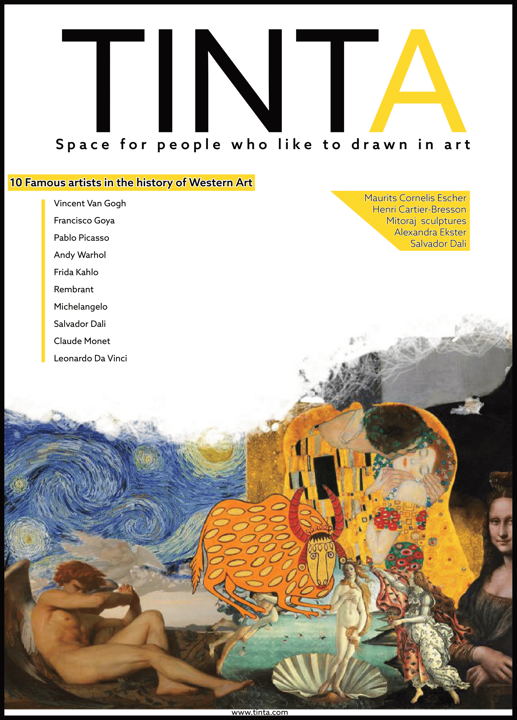
First version cover
Second version cover
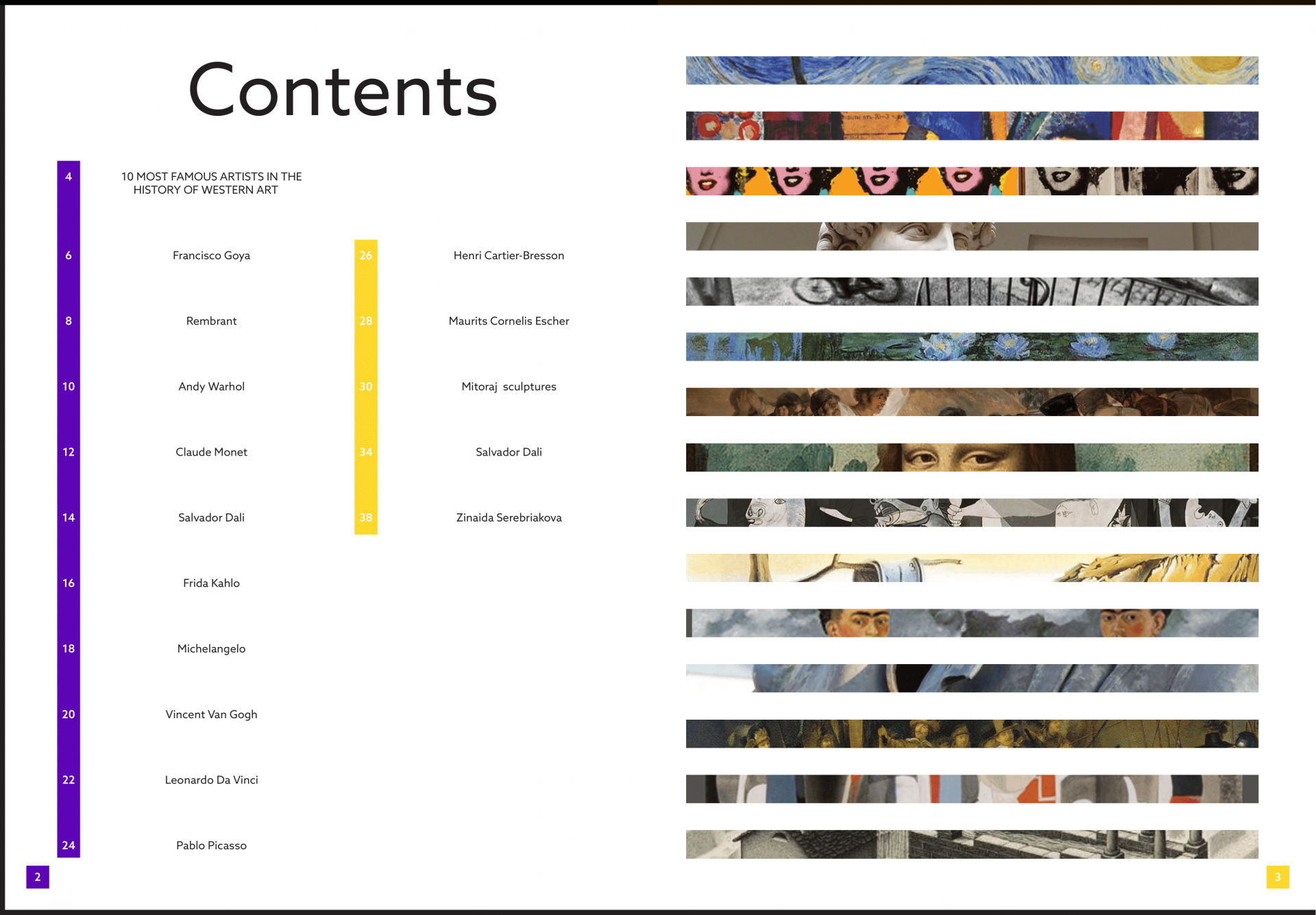
Contents first version
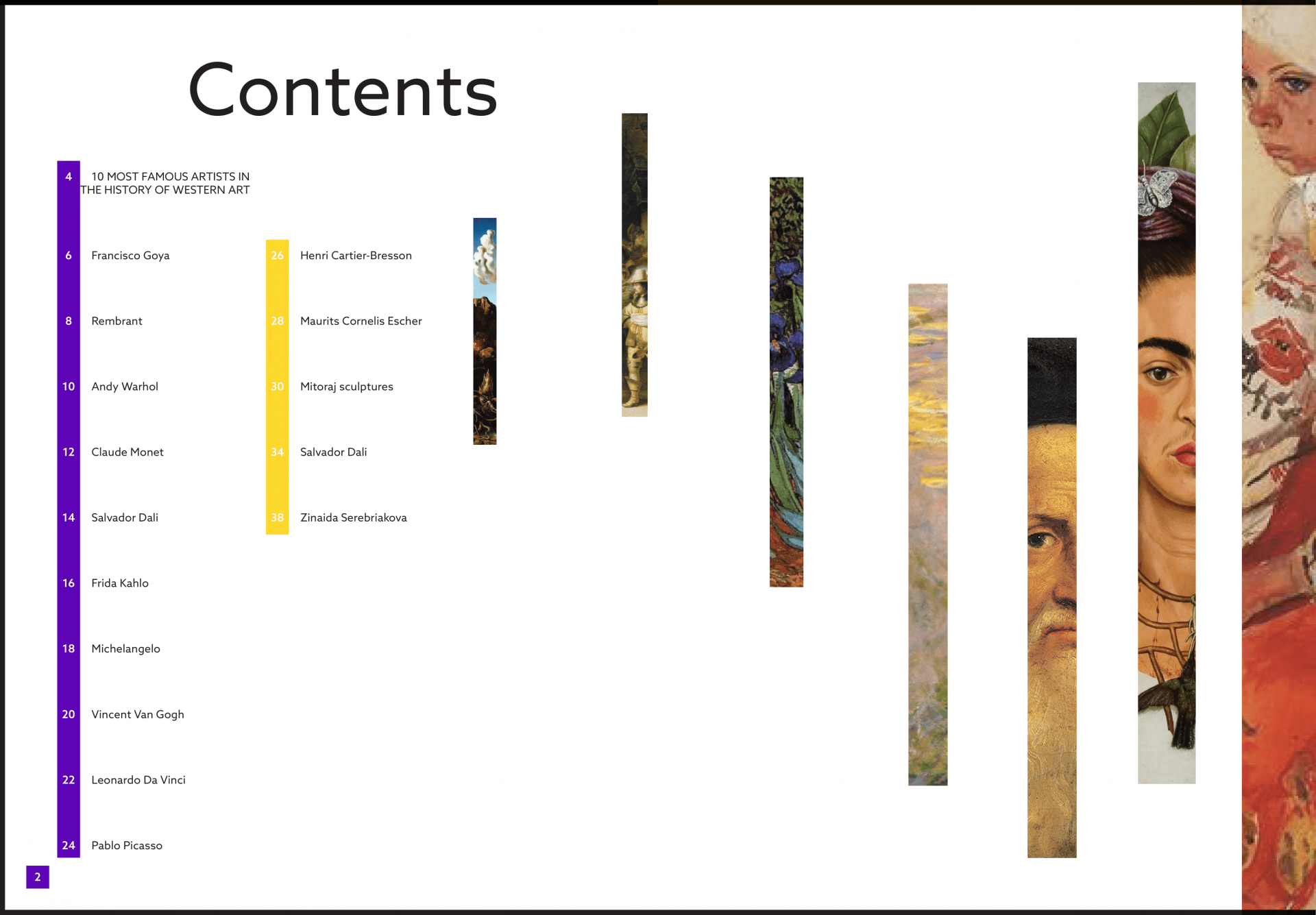
Contents second version
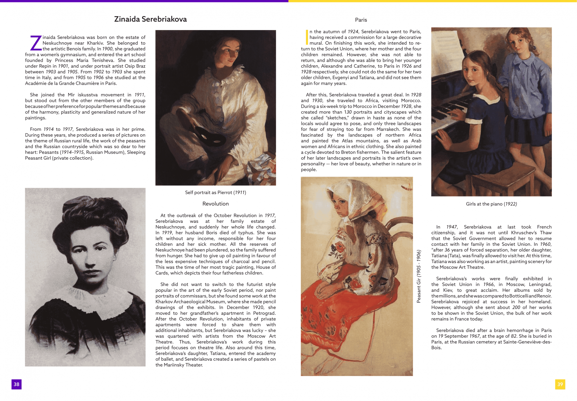
Page 1
Page 2
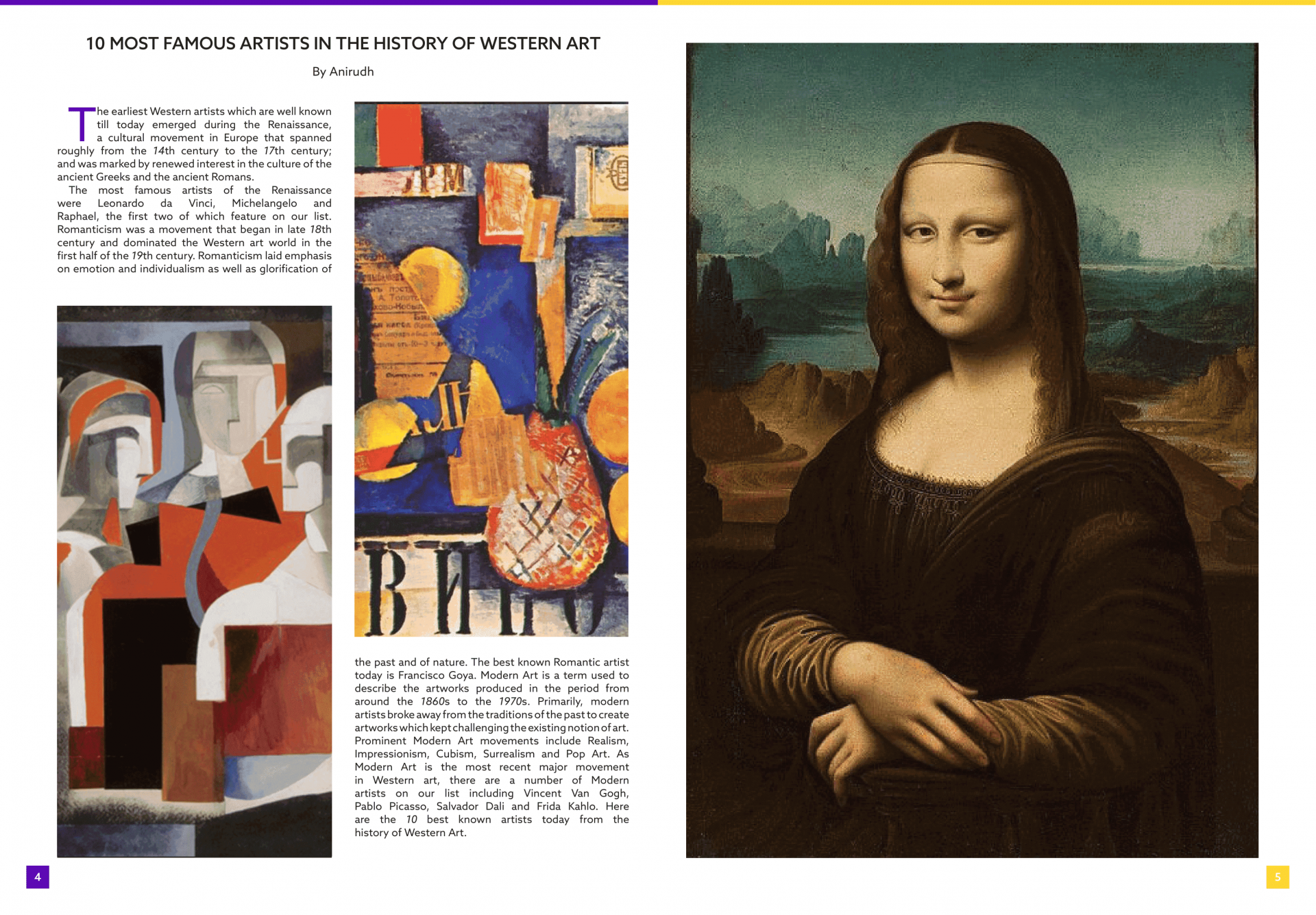
Page 3
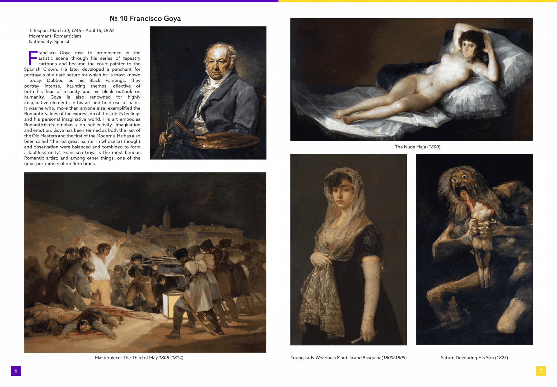
Page 4
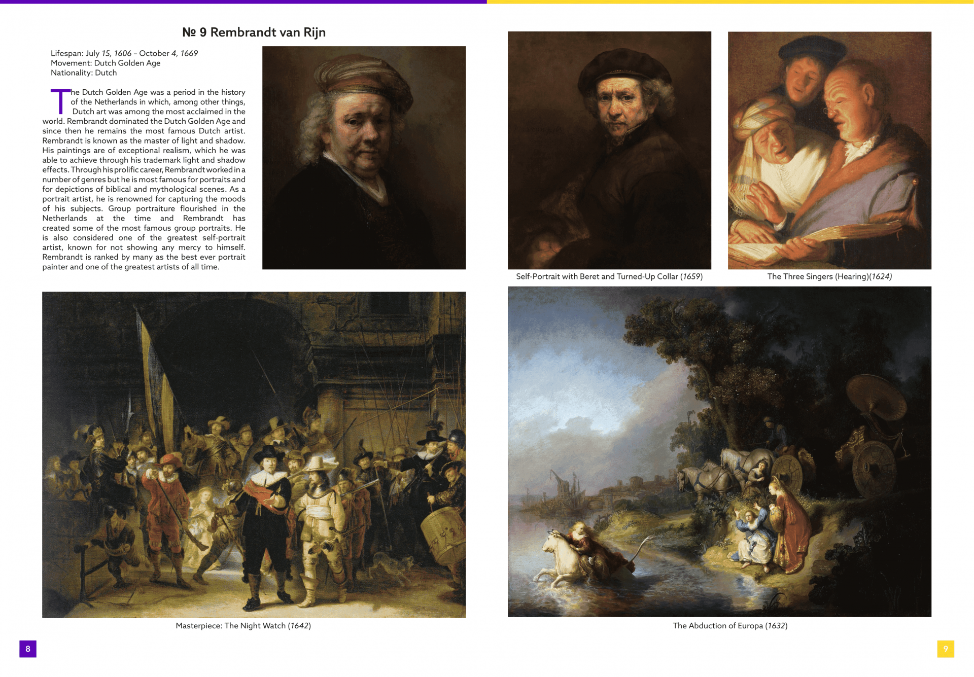
Page 5
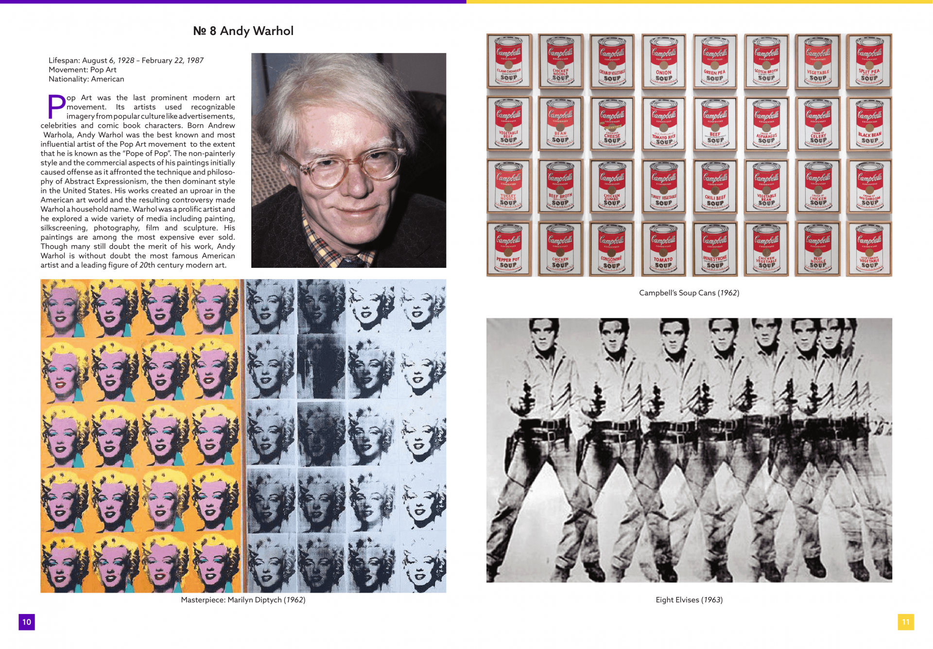
Page 6
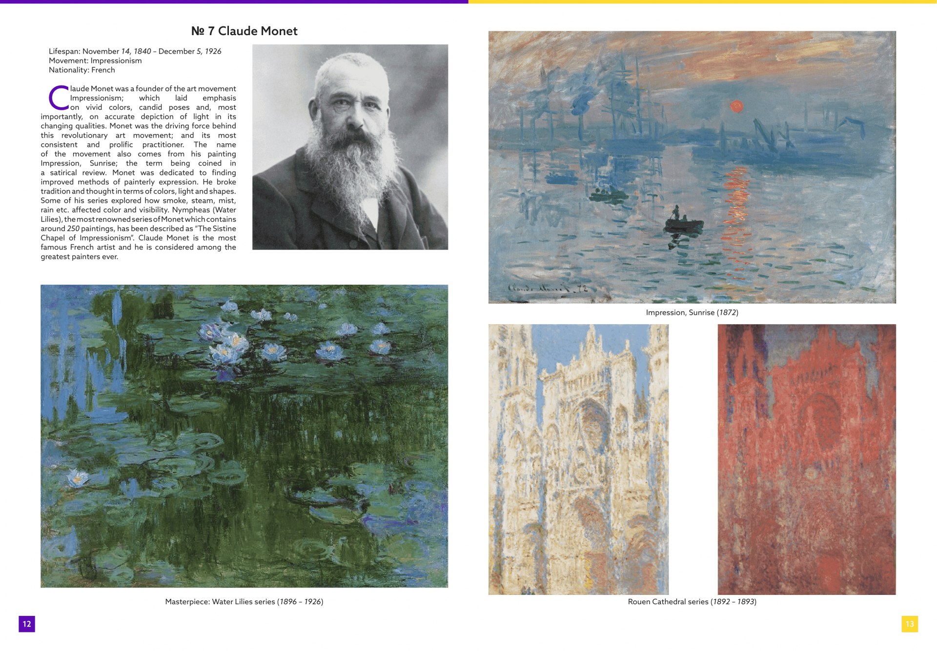
Page 7
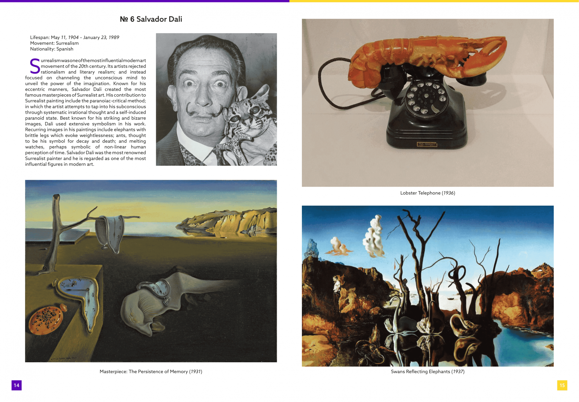
Page 8
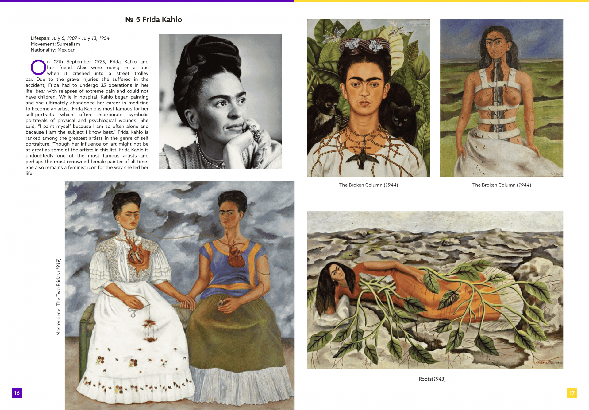
Page 9
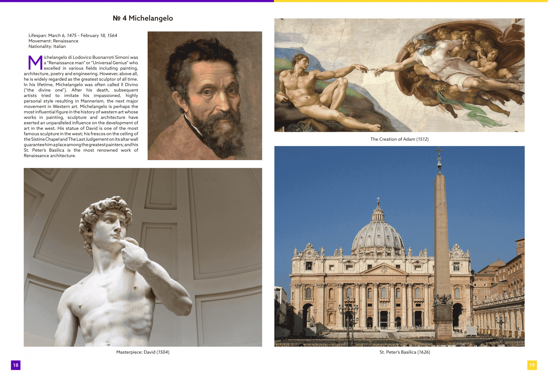
Page 10
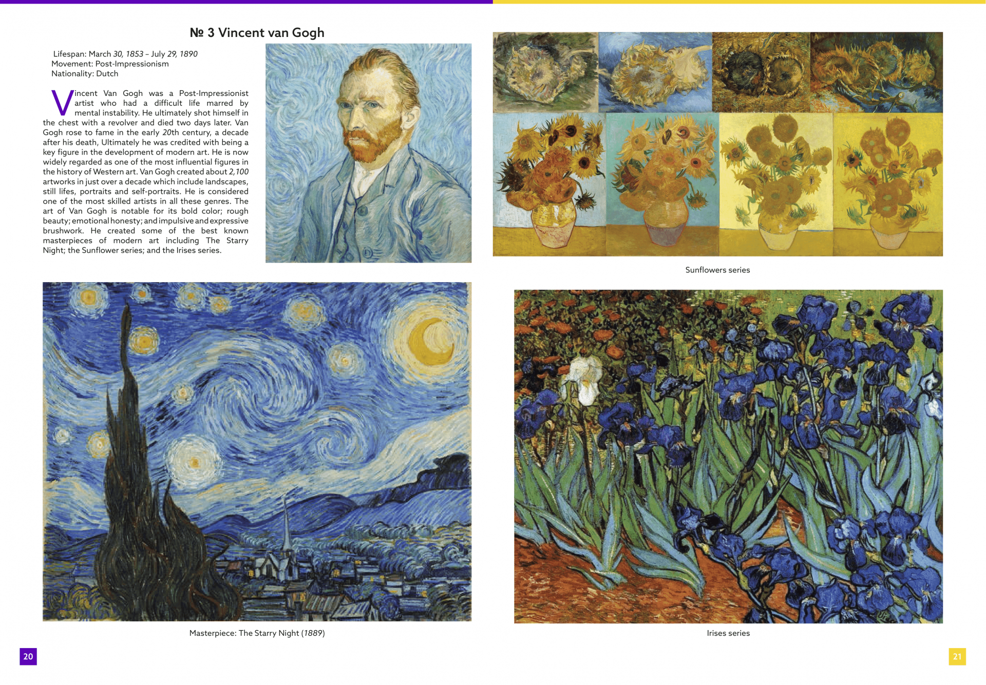
Page AH 11
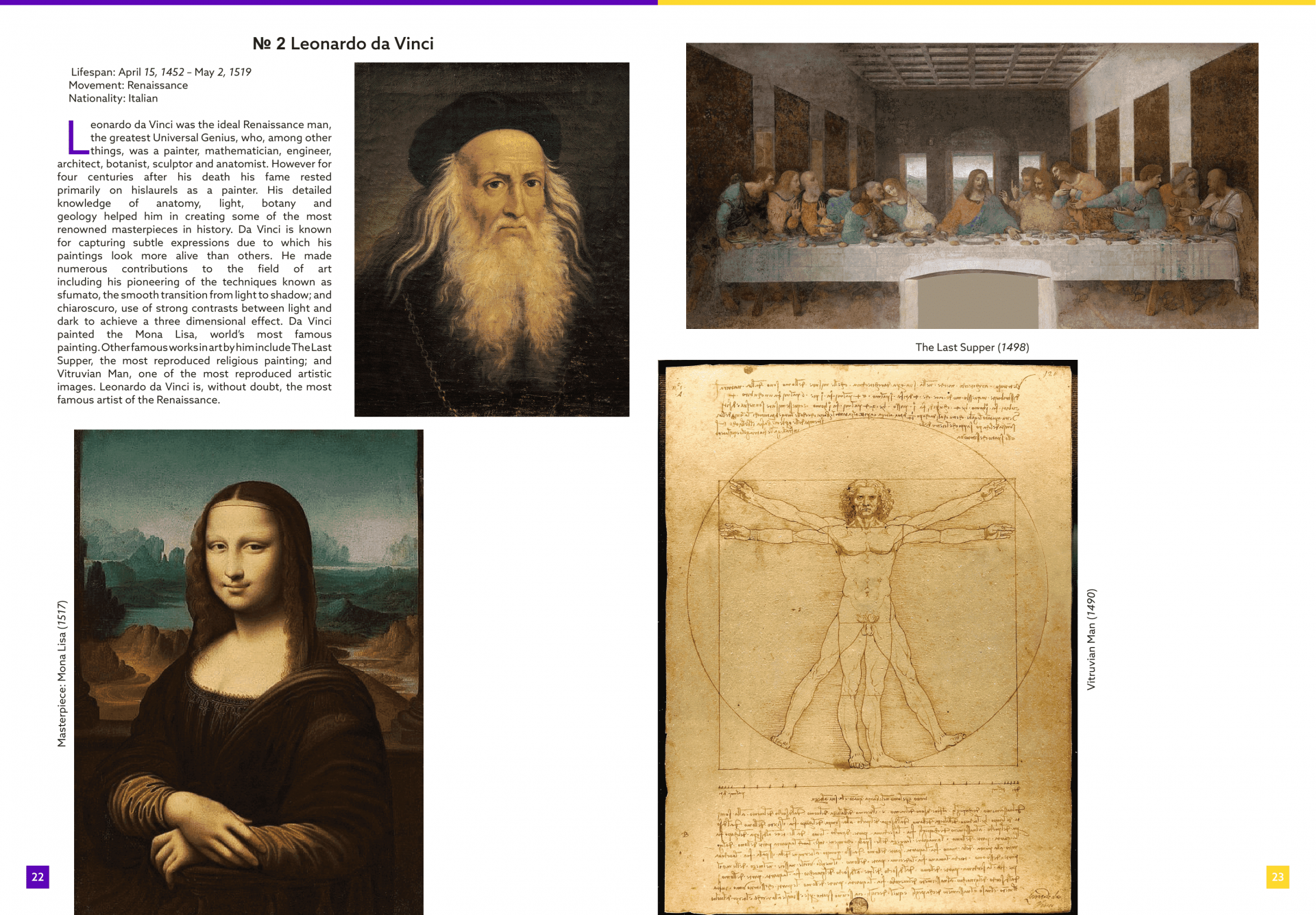
Page AH 12
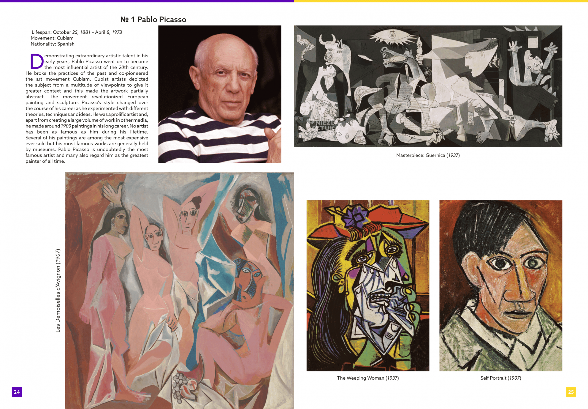
Page AH 13
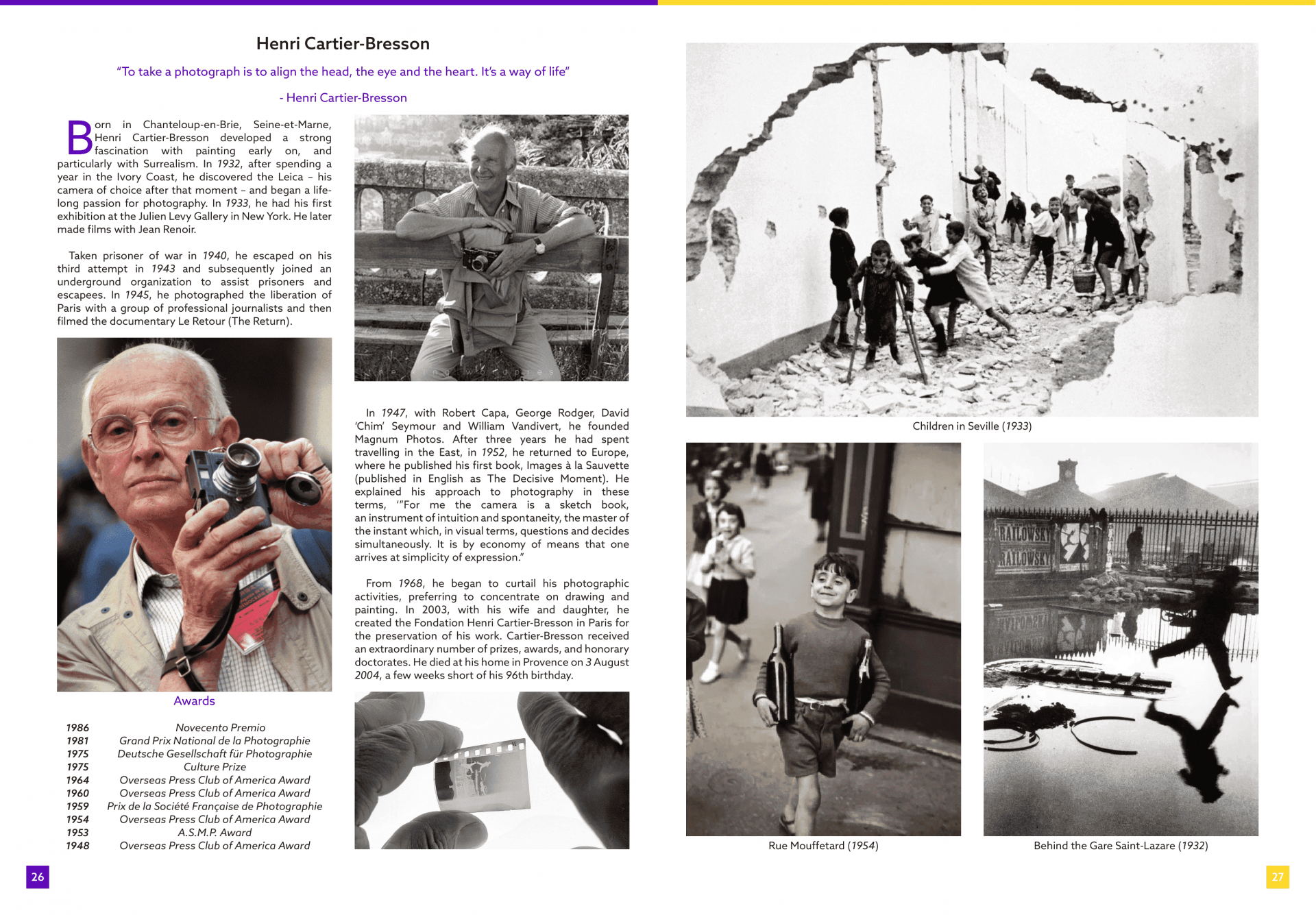
Page AH 14
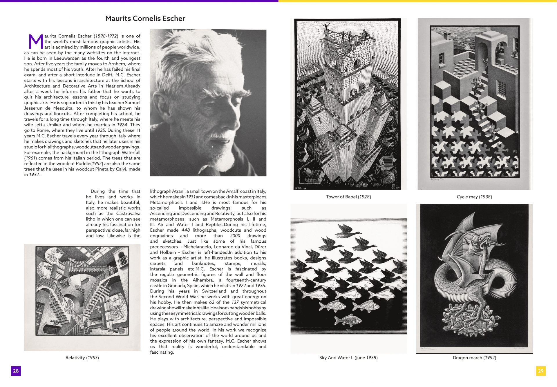
Page AH 15
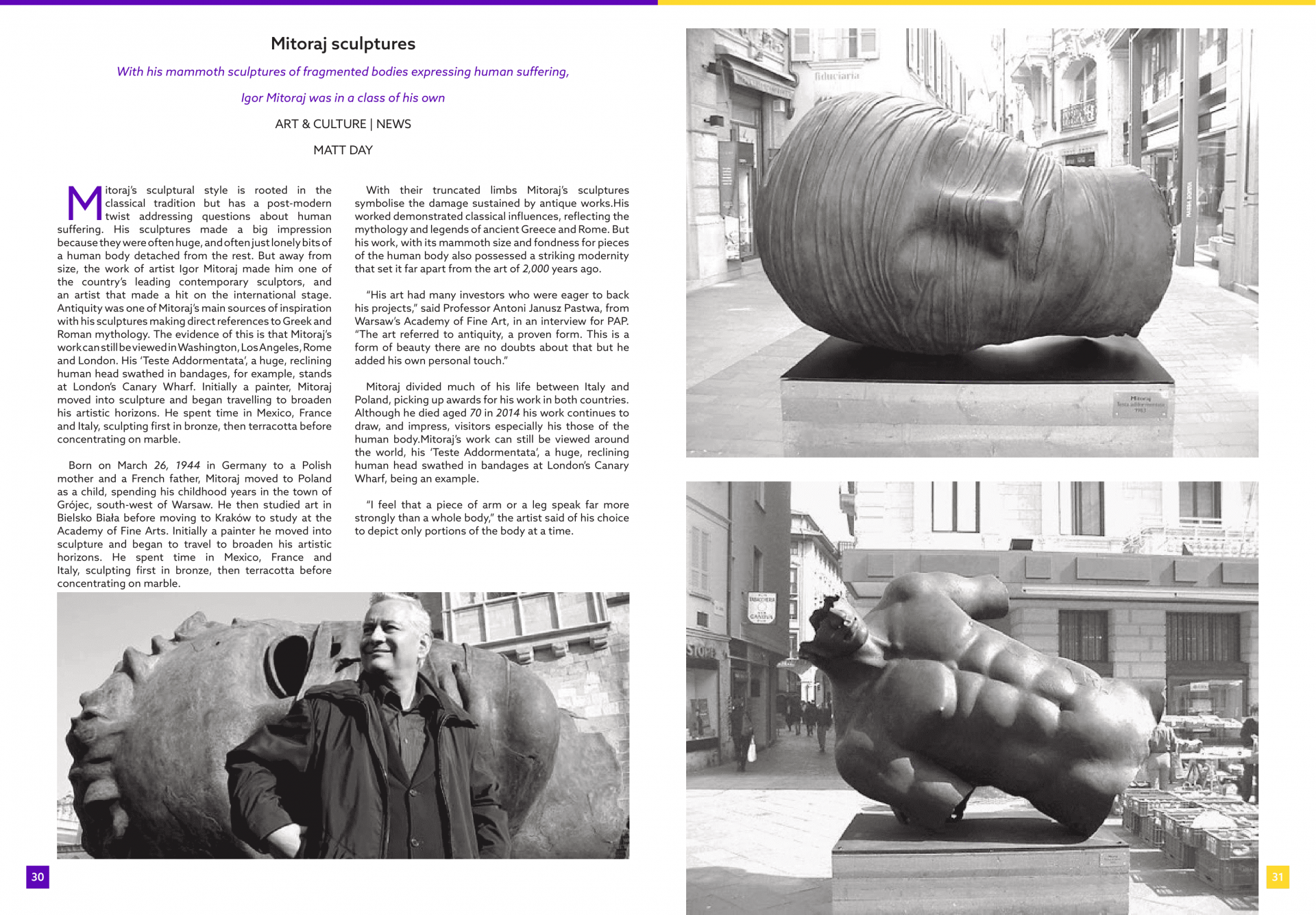
Page AH 16
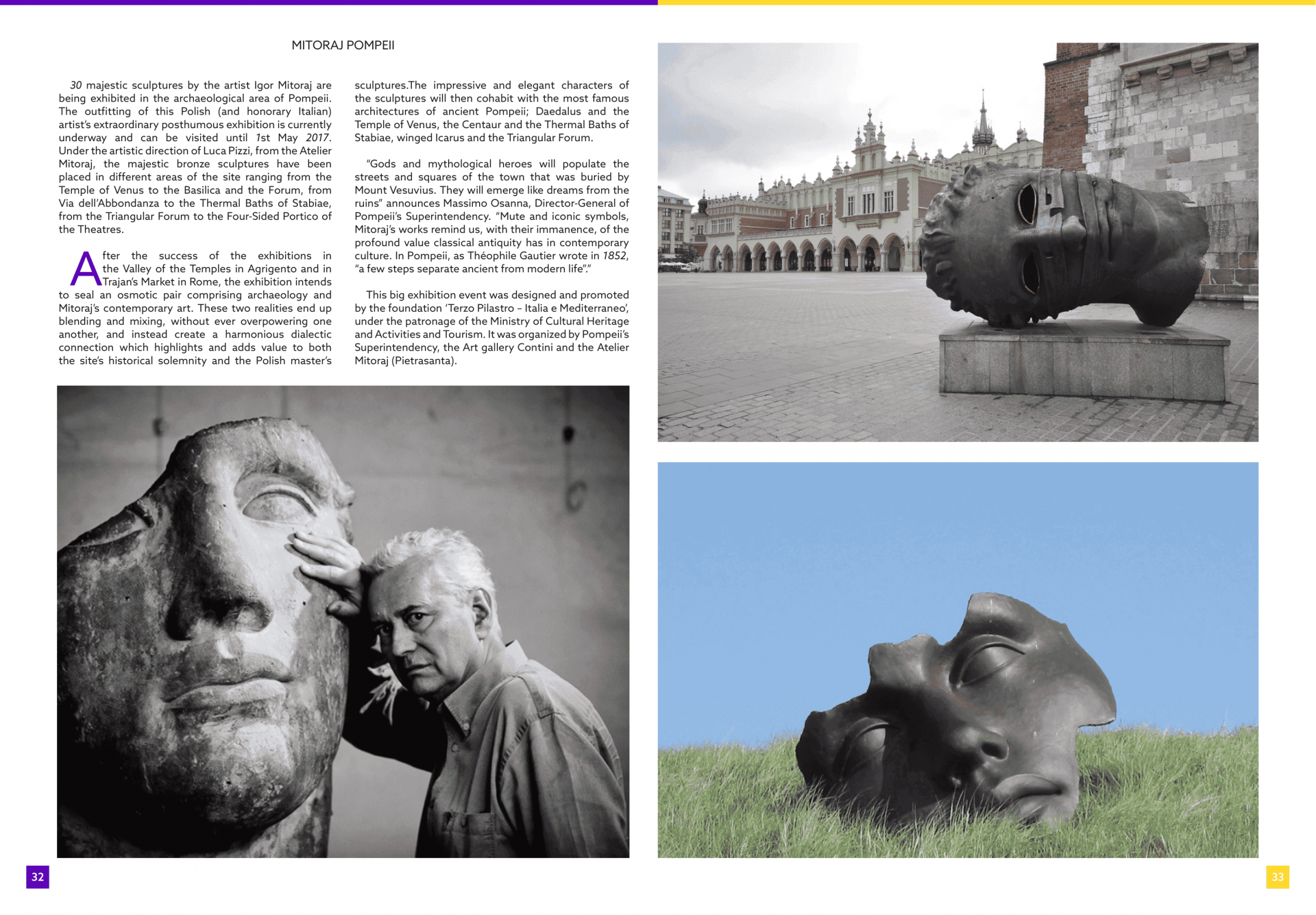
Page AH 17
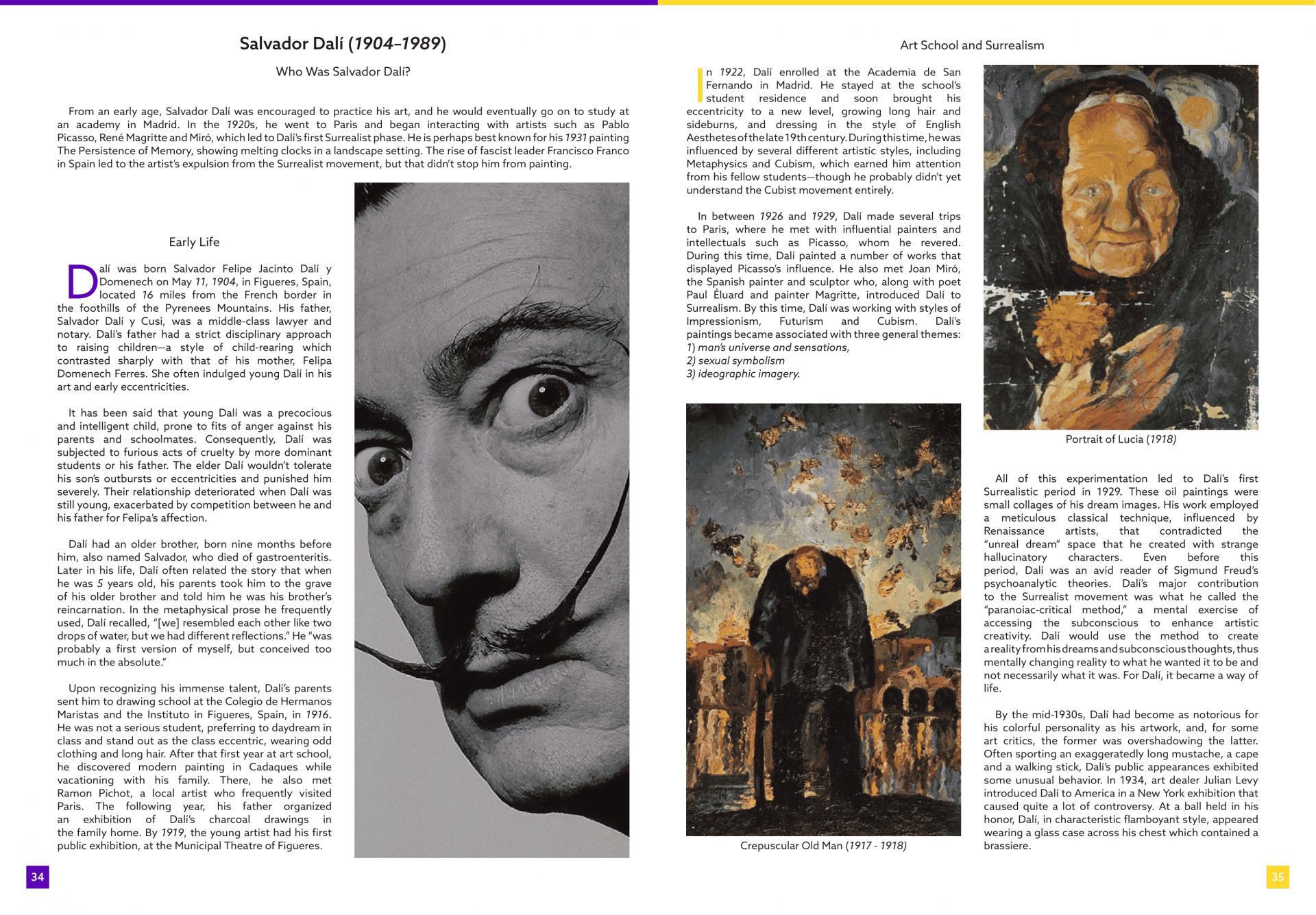
Page AH 18
8. Results and takeaways from a Usability test/before and after applying UX Design to the product
Simple typography, organized layout, and information conveyance.
9. Your final design — style guide
The style guide is simply reading the information about a given topic (artist) and looking at pictures.
10. Conclusion/ The impact
The main conclusion is the process of working on journal creation, making a few variations of which, designing an entertaining and educative product.
11. What did you learn from the project
- To correctly set the layout for the journal
- To work with the given information
- To search for proper media
- To edit text
12. What would be the next steps
The next steps are learning more layouts for journal creation and making more variations of different topics.
Task 1: Affordance
Affordance nr 7
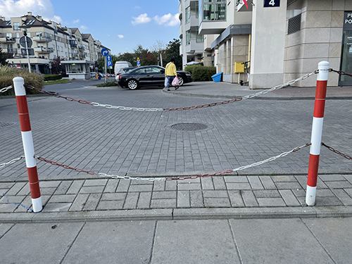
- Affordance – the knowledge acquired from logic and deduction. An object separating a walking zone from traffic indicates its purpose to prevent movement.
- Marker – Red and white colors.
- Mapping – none.
- Feedback – none
- Rating: good design
Affordance nr 5
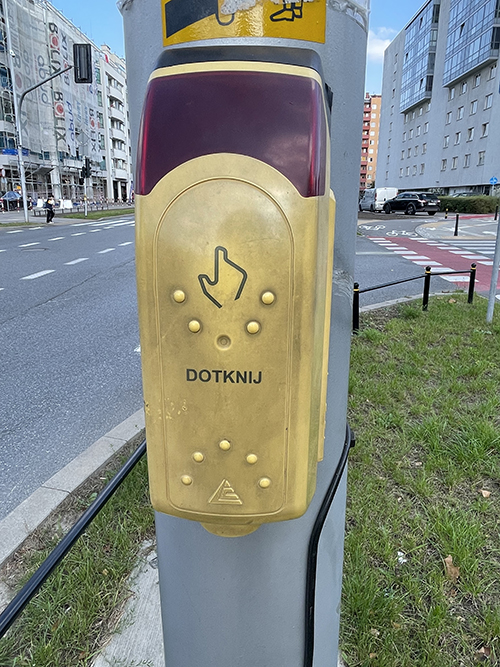
- Affordance – the knowledge acquired from logic and deduction. An object with proper mapping located next to a crosswalk and traffic lights indicates its purpose to fasten traffic lights time.
- Marker – Word and the hand symbol.
- Mapping – hand symbol pointing.
- Feedback – lights up with a special sound.
- Rating: good design
Affordance nr 24
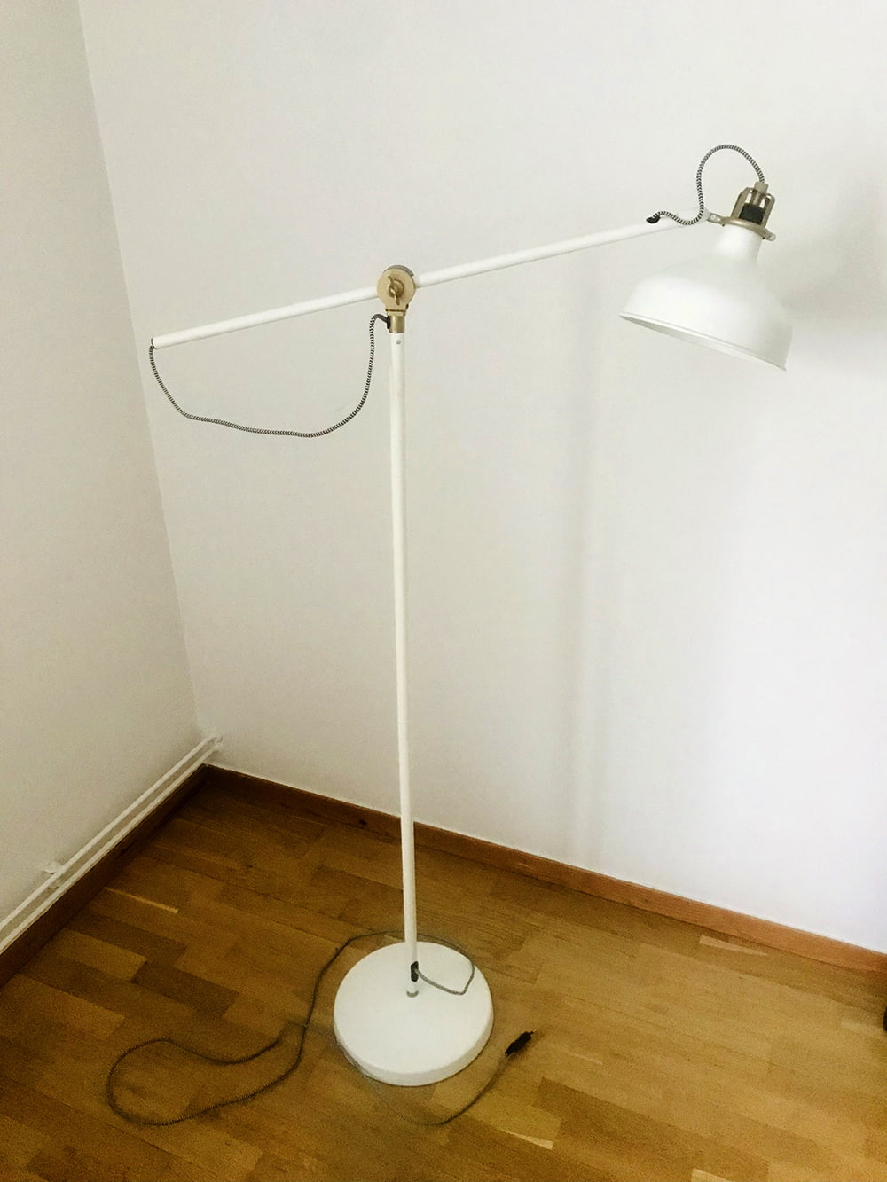
- Affordance – the knowledge acquired from acquired knowledge. A lamp is a regular day object for most people.
- Marker – none.
- Mapping – none.
- Feedback – none.
- Rating: good design
Affordance nr 8
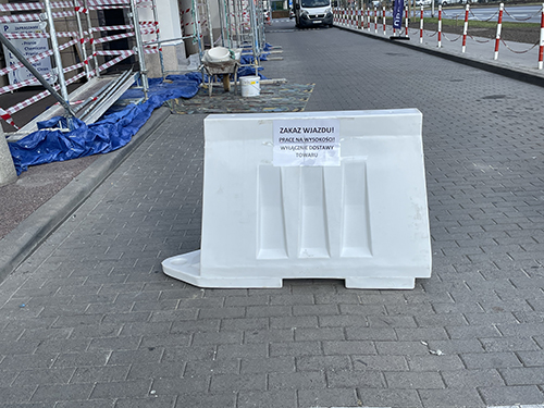
- Affordance – the knowledge acquired from logic and deduction. An object in the middle of traffic or a walking zone indicates its purpose to prevent movement.
- Marker – the paper with the text.
- Mapping – none.
- Feedback – none.
- Rating: medium design
Affordance nr 16
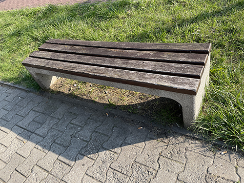
- Affordance – the knowledge acquired from experience with a clear understanding of use. A bench is an everyday life object for most people.
- Marker – none.
- Mapping – none.
- Feedback – none.
- Rating- built with solid durable materials which will ensure long-lasting use medium design.
Affordance nr 12
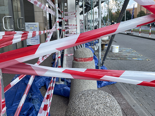
- Affordance – the knowledge acquired from logic and deduction. An object separating a door from people indicates its purpose to prevent movement and interaction.
- Marker – red and white colors.
- Mapping – none.
- Feedback – none.
- Rating: medium design
Affordance nr 19
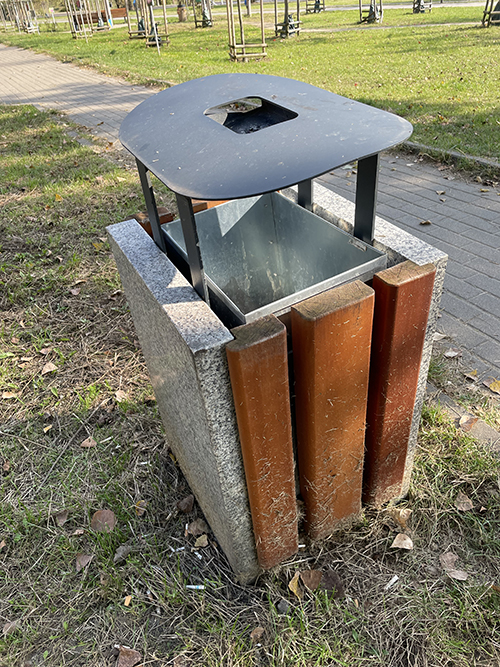
- Affordance – the knowledge acquired from logic and deduction. The garbage can is a regular day object in urban space.
- Marker – none.
- Mapping – none.
- Feedback – none
- Rating: medium design
Affordance nr 21
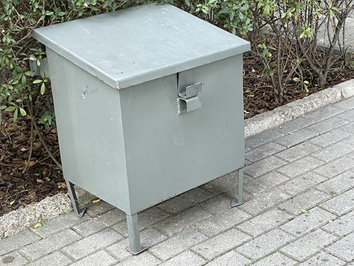
-
- Affordance – the knowledge acquired from experience. A gray box without any mapping has no use for a regular person.
- Marker – none.
- Mapping – none.
- Feedback – none
- Rating: bad design.
Affordance nr 23
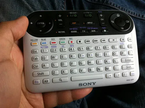
- Affordance – the knowledge acquired from experience. A controller with dozens of buttons will only confuse a person without any experience.
- Marker – some of the buttons have a specific color or short description.
- Mapping – symbols on buttons.
- Feedback – unclear, something happens as we press the buttons.
- Rating: bad design.
Affordance nr 11
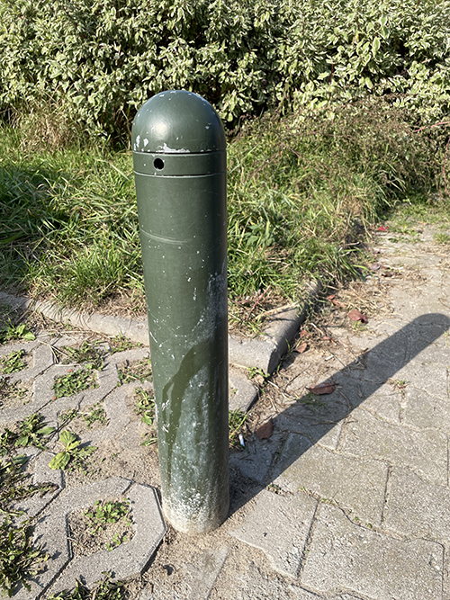
- Affordance – the knowledge acquired from experience. A short pillar on the sidewalk.
- Marker – none.
- Mapping – none.
- Feedback – none.
- Rating: bad design.
Affordance B
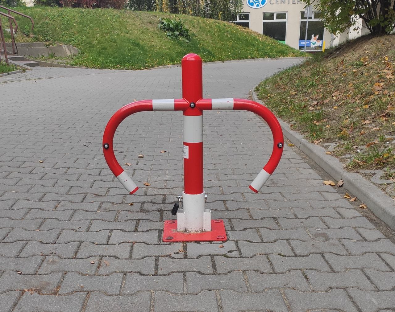
- Affordance – the knowledge acquired from logic and deduction. An object separating a walking zone from traffic indicates its purpose to prevent movement.
- Marker – Red and white colors.
- Mapping – none.
- Feedback – none
- Rating: good design
Affordance E
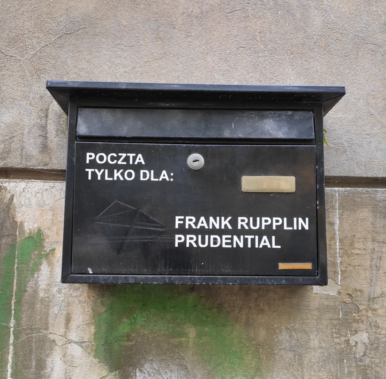
- Affordance – the knowledge acquired from experience and deduction. A box with mappings and a hole for mail.
- Marker – the text shows the purpose of the box.
- Mapping – none.
- Feedback – none
- Rating: medium design.
Affordance A
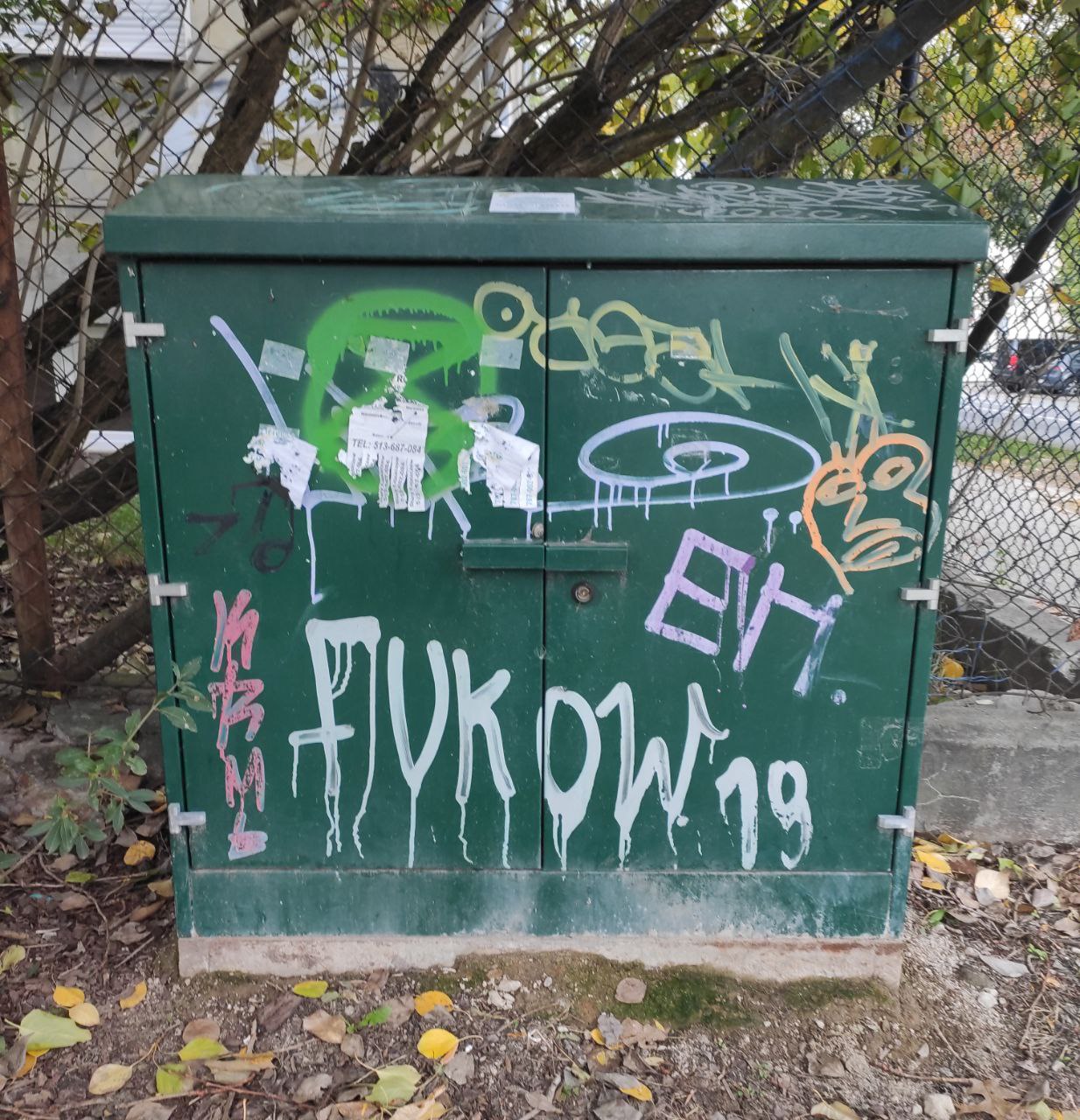
- Affordance – the knowledge acquired from experience and logic. A box with two doors is a place for keeping electric components inside.
- Marker – weird drawings done by teenagers or kids only create confusion.
- Mapping – none.
- Feedback – none
- Rating: medium design.
Affordance C
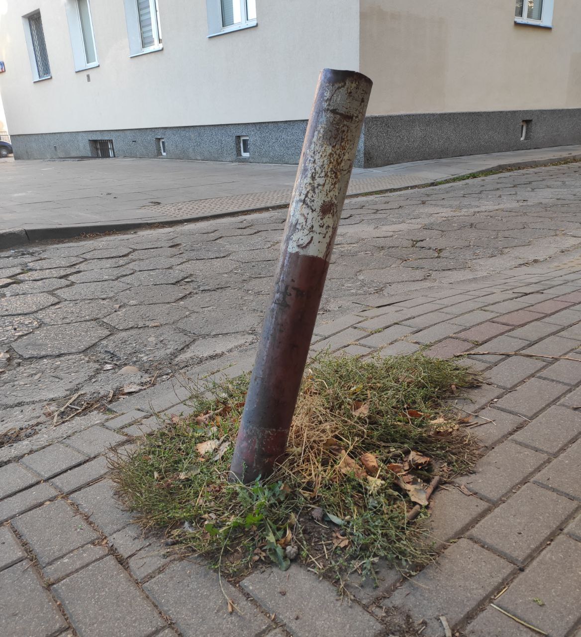
- Affordance – the knowledge acquired from logic and deduction. An object separating a walking zone from traffic indicates its purpose to prevent movement.
- Marker – once red and white colors are now grey and dirty.
- Mapping – none.
- Feedback – none.
- Rating: bad design.
Affordance D
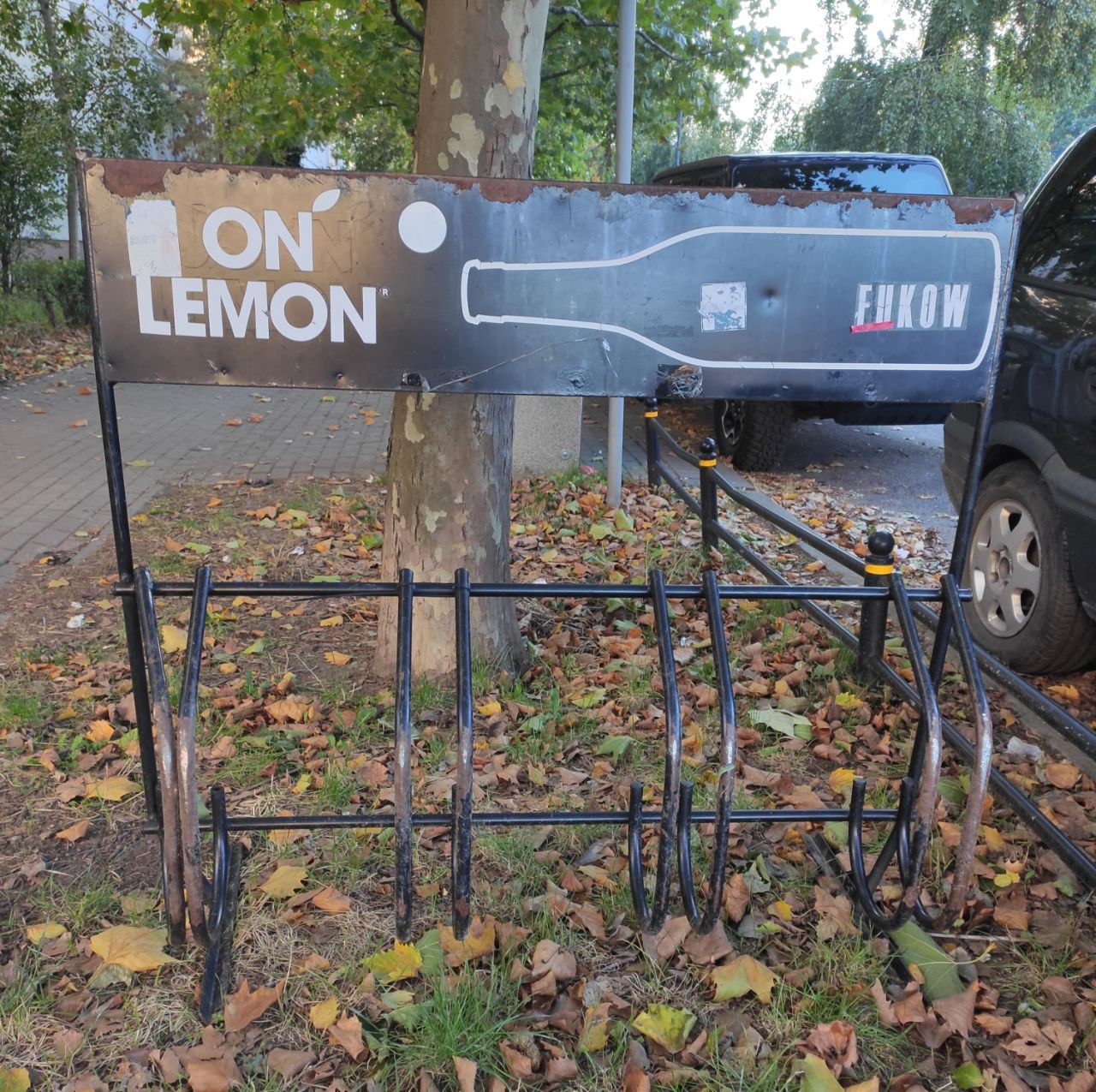
- Affordance – the knowledge acquired from experience and logic. Structure of iron vires combined with a commercial banner.
- Marker – none with a banner which can only cause confusion.
- Mapping – none.
- Feedback – none
- Rating: bad design.
Task 2: How I feel in the morning